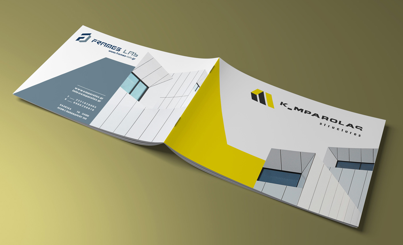
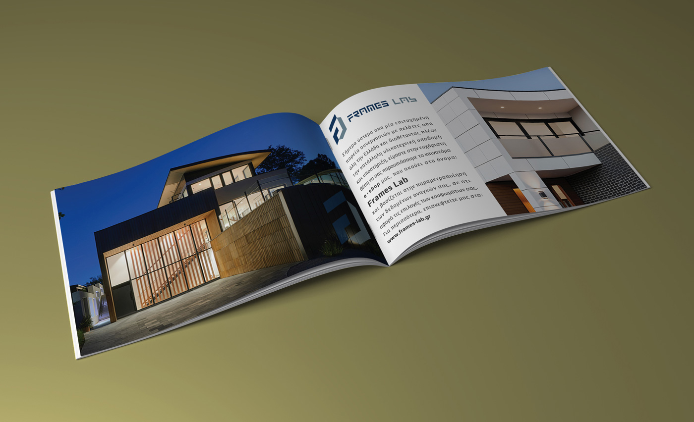
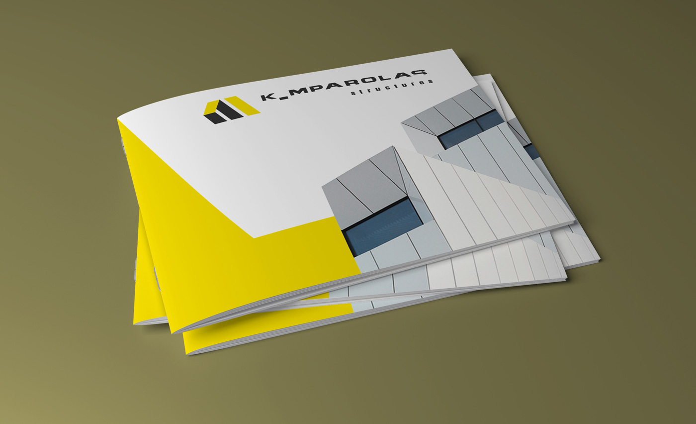
Logo Design – Brochure Design, FRAMES LAb by K _ MPAROLAS structures, Chalkida
Logo Design – Symbol – Corporate Identity Design
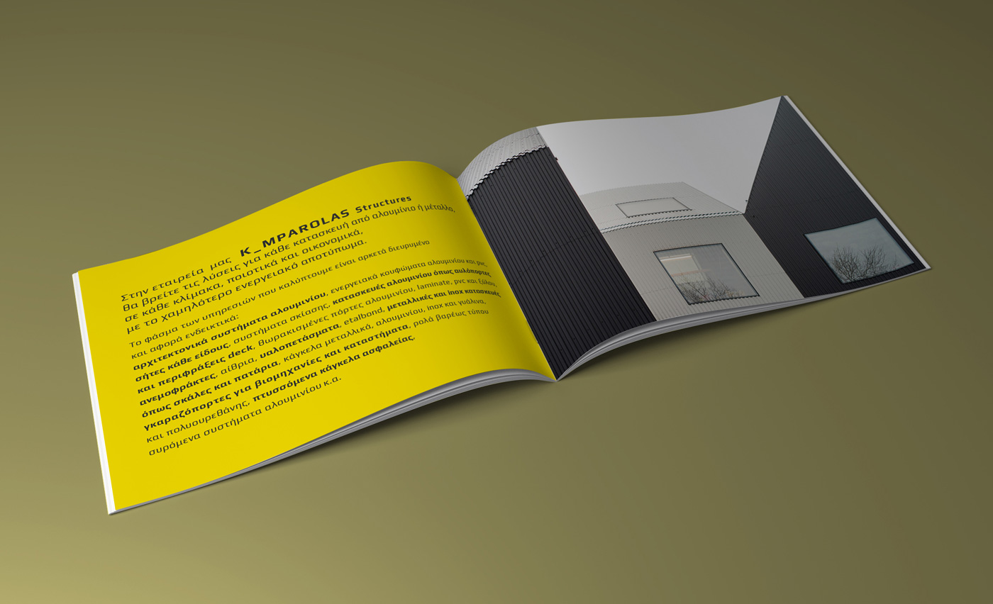
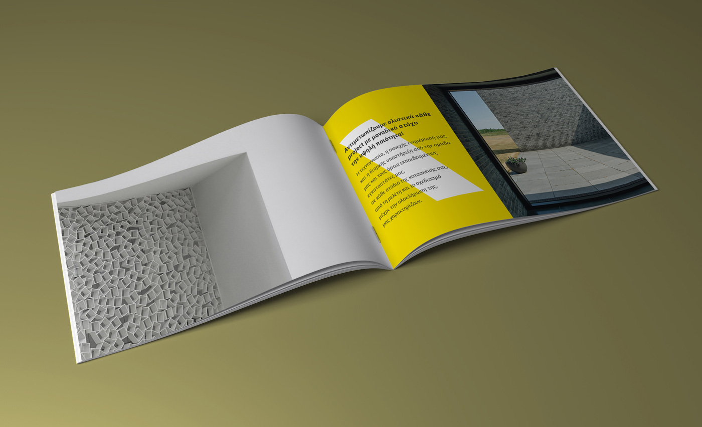
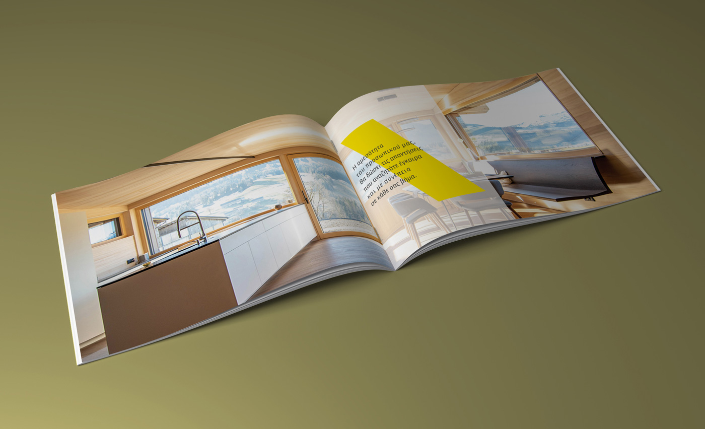
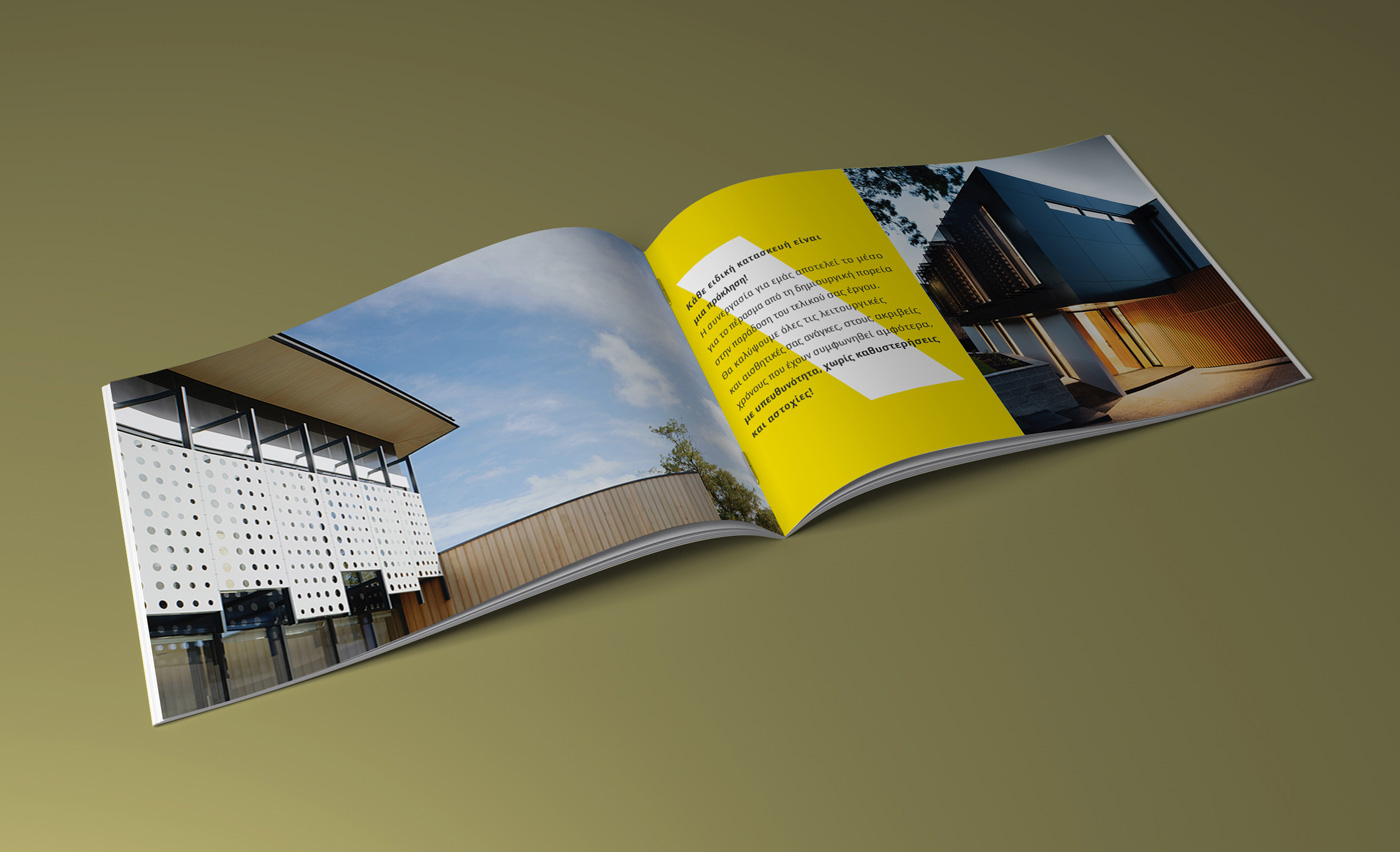
Brochure Design – Copywriting – Slogan
Creative Applications
© Knowledge Game Design Studio, NIKOLAOS ZISIS
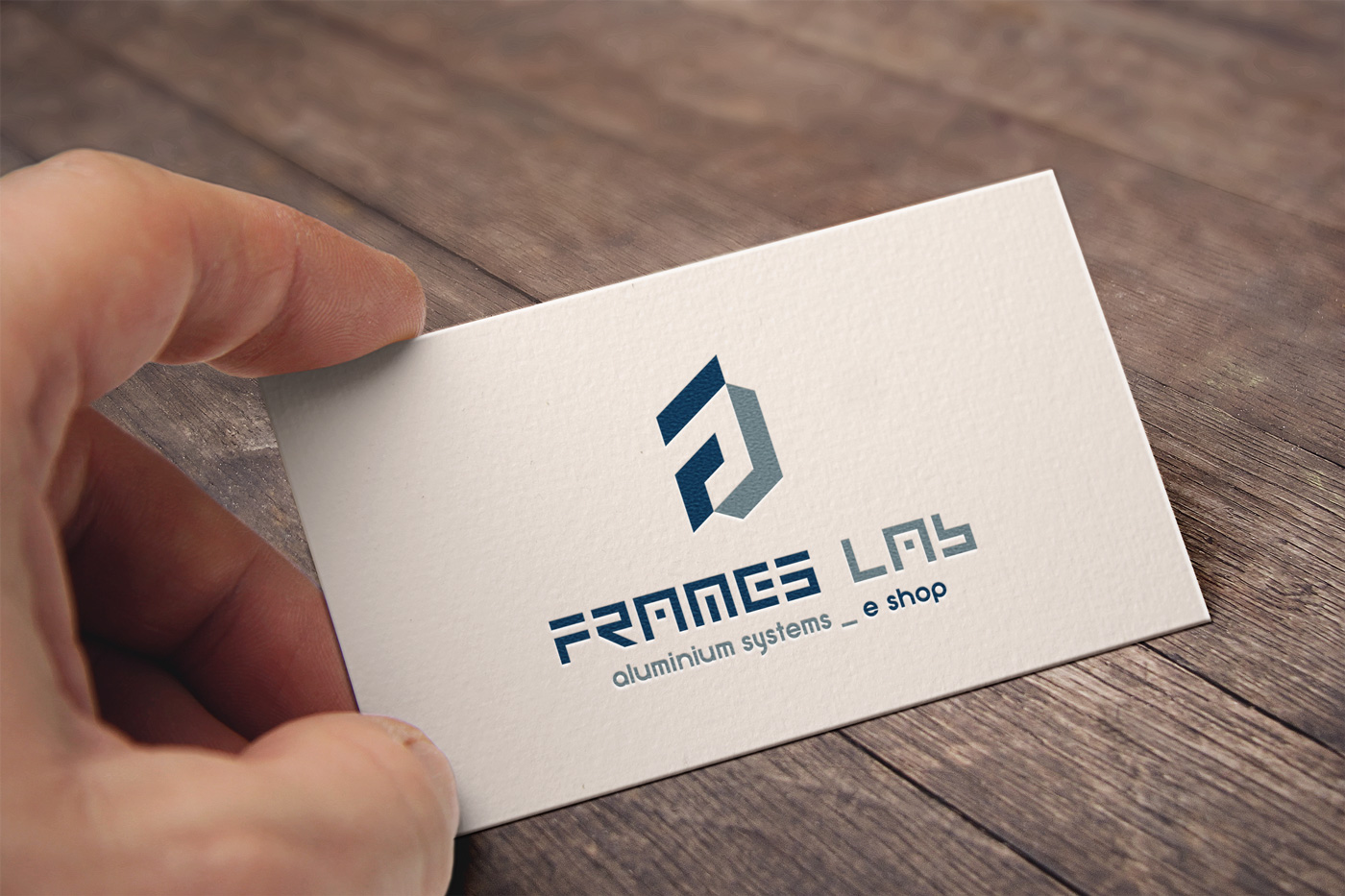
The corporate identity for FRAMES LAb was developed around a symbol that functions both as a logo and a lettermark, combining the letter F with an inverted L. Together, they form an abstract, three‑dimensional frame that visually references the company’s core activity in a minimal, architectural manner. The wordmark was designed with a highly customized, architectural typographic approach, reflecting the precision and quality of the company’s aluminum and PVC frame construction and installation services. The color palette, featuring two shades of navy blue — dark and light — reinforces a sense of reliability and technical expertise. All corporate applications follow the same compositional logic with strict consistency, resulting in a cohesive and distinctive visual identity.