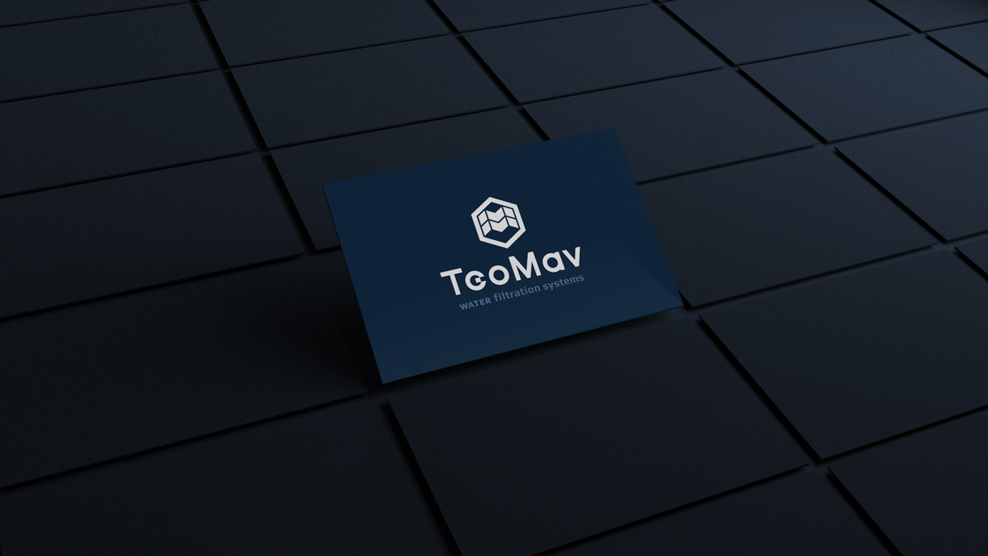
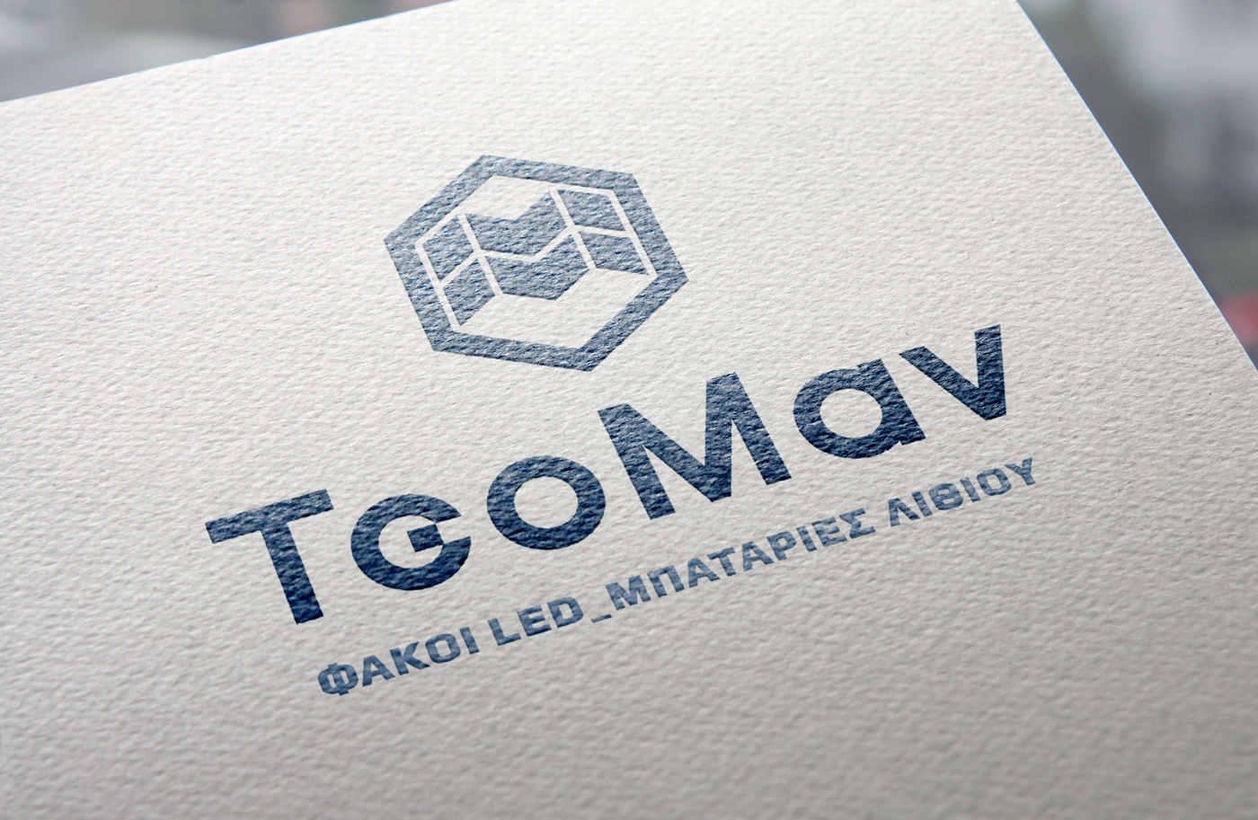
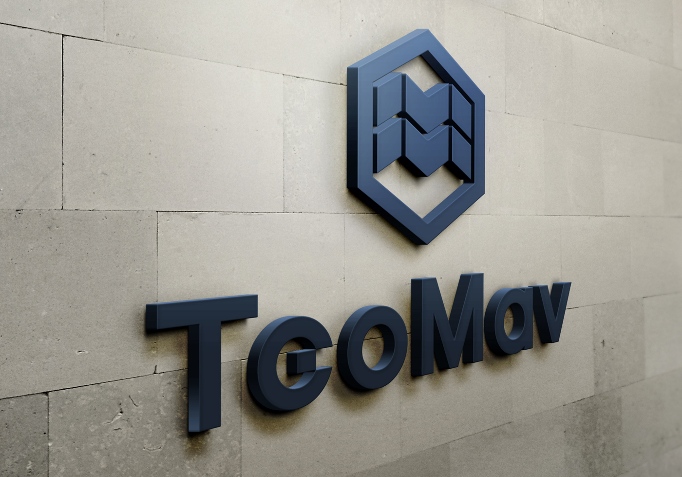
Logo Design – Corporate Identity Design, TeoMav WATER FILTER SYSTEMS / LED FLASHLIGHTS – LITHIUM BATTERIES, Thessaloniki
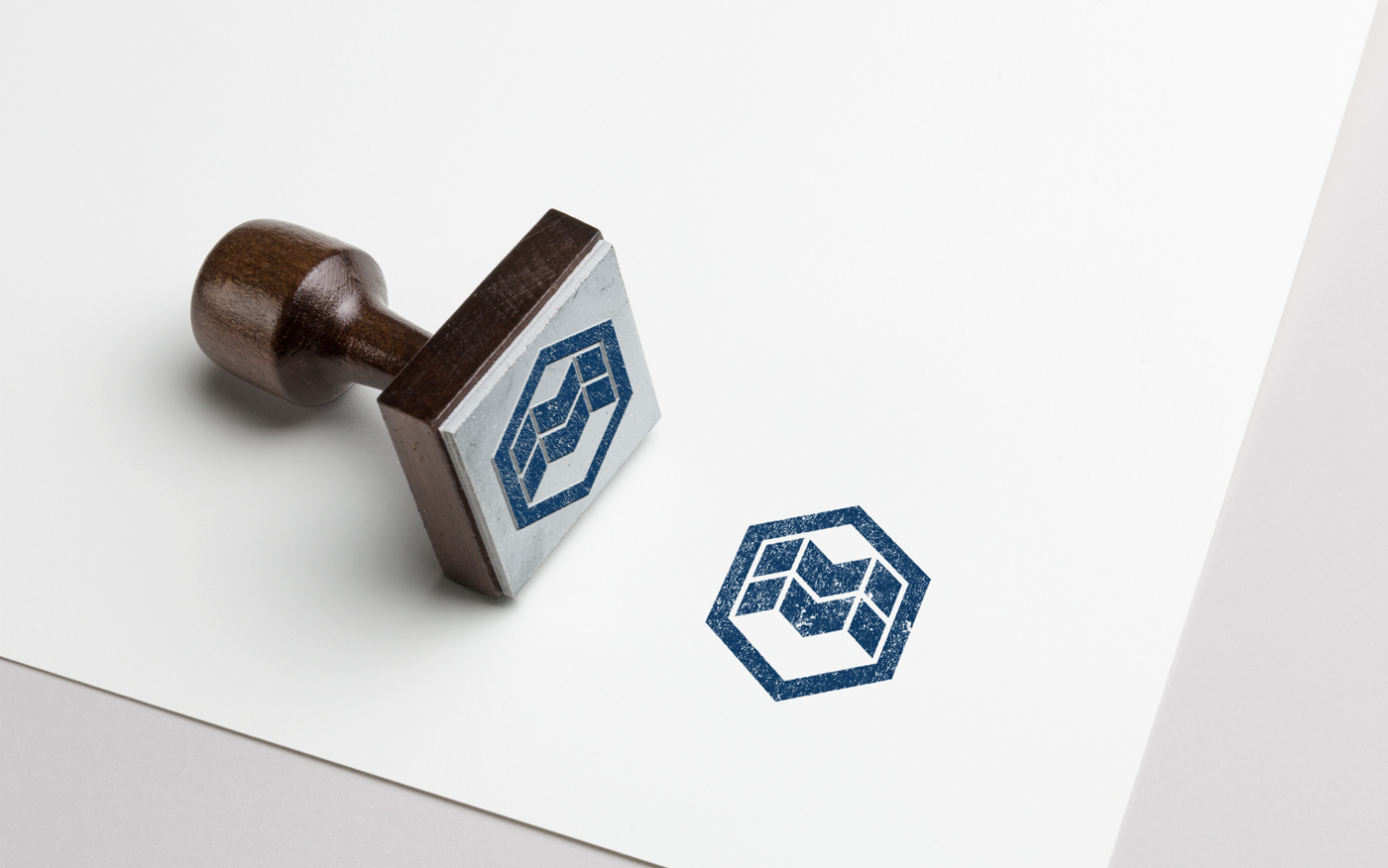
Logo Design – Symbol – Corporate Identity Design
Copywriting – Slogan – Creative Applications
© Knowledge Game Design Studio, NIKOLAOS ZISIS
The corporate identity for TeoMav was developed around an abstract symbol placed within a hexagonal outline — a form referencing both the cellular structures of water filters and the geometric modules of LED technology, two of the company’s core product categories. Inside the hexagon, an abstract double‑M lettermark emerges, inspired by the founder’s surname Mavridis, creating a strong and distinctive visual signature. The TeoMav wordmark follows the same principles of clarity and minimal typographic construction, expressing the company’s reliability and technical expertise. The color palette, featuring deep navy and navy‑raf blue, reinforces the brand’s sense of quality, professionalism, and technological precision. All corporate applications maintain strict visual consistency, resulting in a cohesive and authoritative identity.