
Logo Design – Corporate Identity, GK electromechanical solutions, Ilion Attica
Logo Design – Corporate Identity
© Knowledge Game Design Studio, NIKOLAOS ZISIS
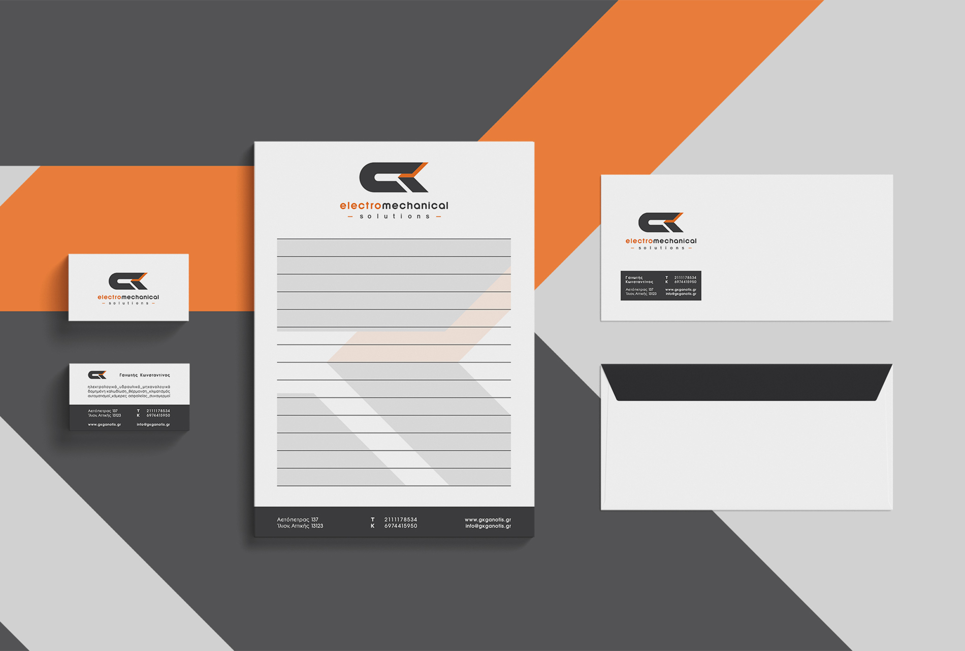
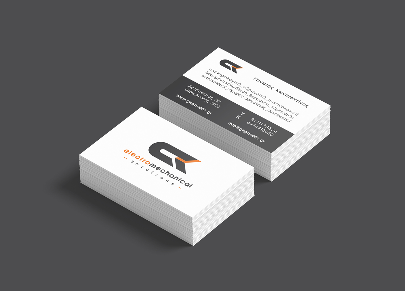
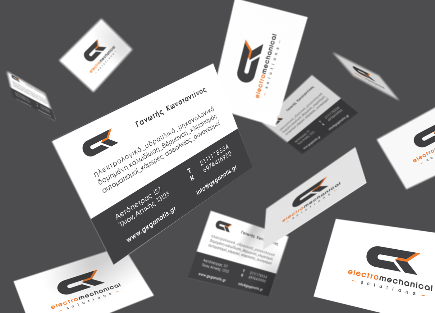
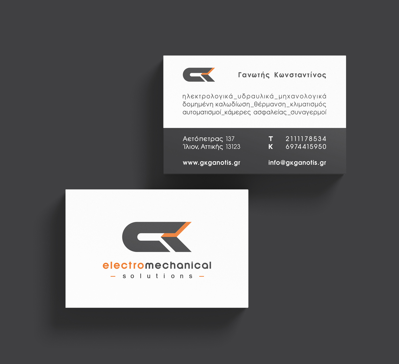
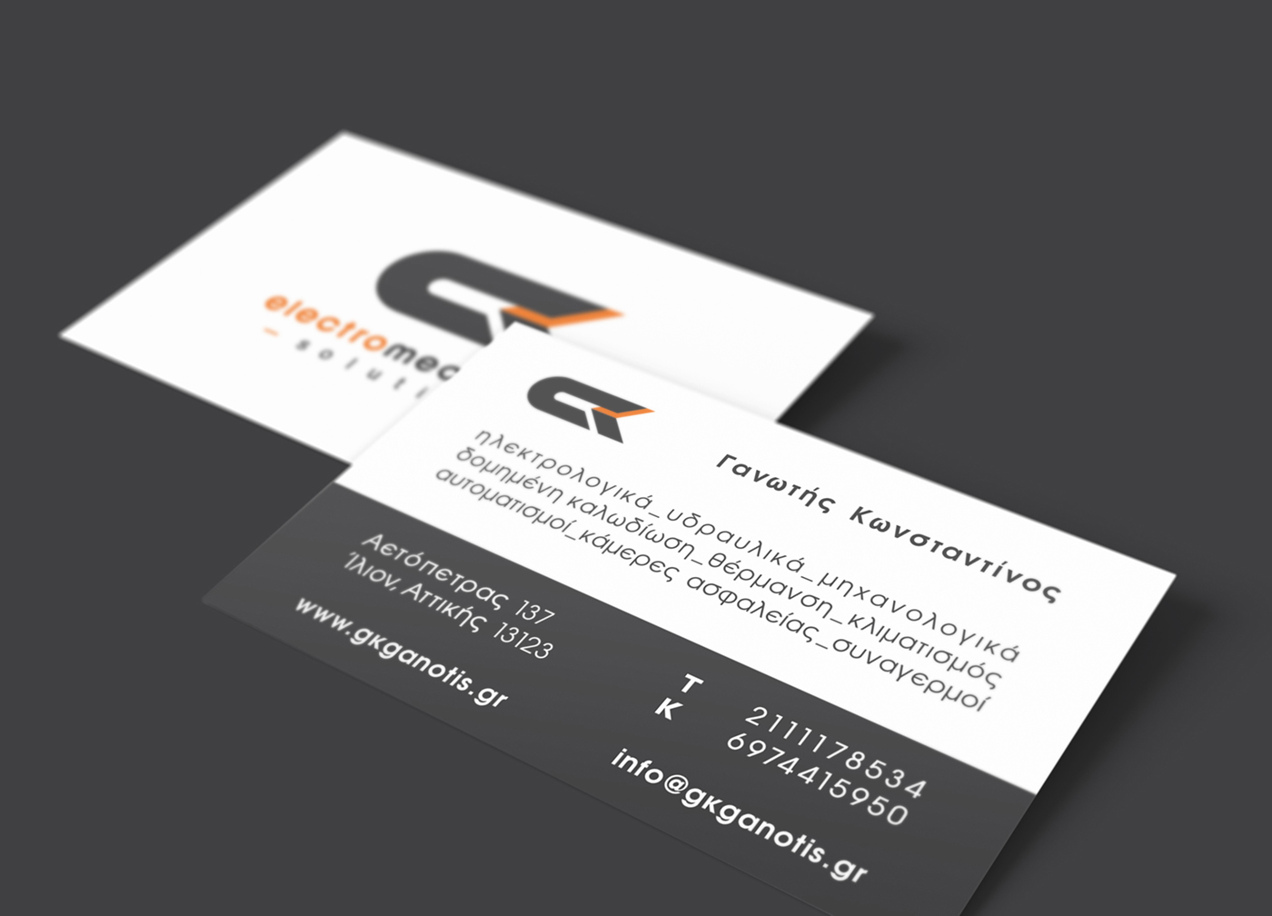
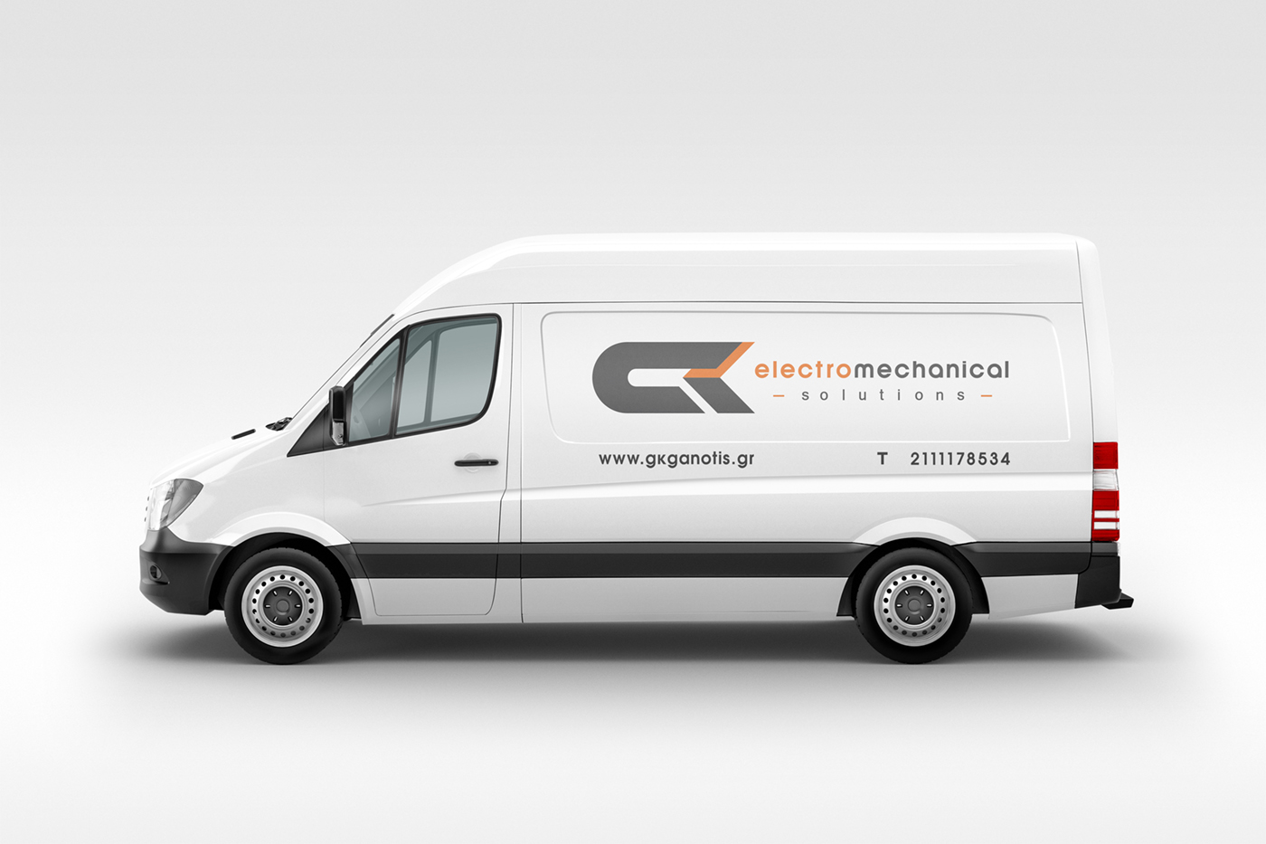
For the logo design, we created an abstract “GK” lettermark, derived from the initials of Gannotis Konstantinos, founder of the electromechanical installations company. The G is shaped to resemble a magnet or an electrical circuit, visually referencing the nature of the services and reinforcing the technical identity of the brand.
The color palette—a combination of dark grey and orange—effectively conveys the character of the services: reliability, precision, and technical expertise. All supporting wordmarks are set in sans serif typefaces, enhancing the modern, clean, and engineering‑oriented aesthetic.
Close‑up applications of the logo create interesting visual compositions, as the geometry of the lettermark forms graphic‑like patterns, offering additional flexibility and depth across the corporate identity system.