Logo Design – Creative Applications, baby college — Model Preschool, Psachna Evias
Logo Design – Corporate Identity – Illustration – Creative Applications
© Knowledge Game Design Studio, NIKOLAOS ZISIS
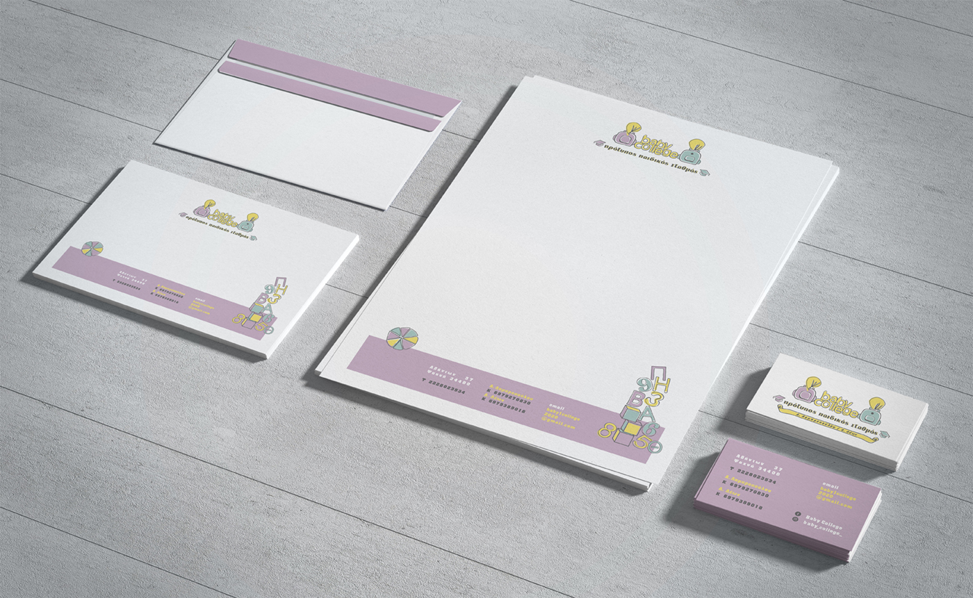
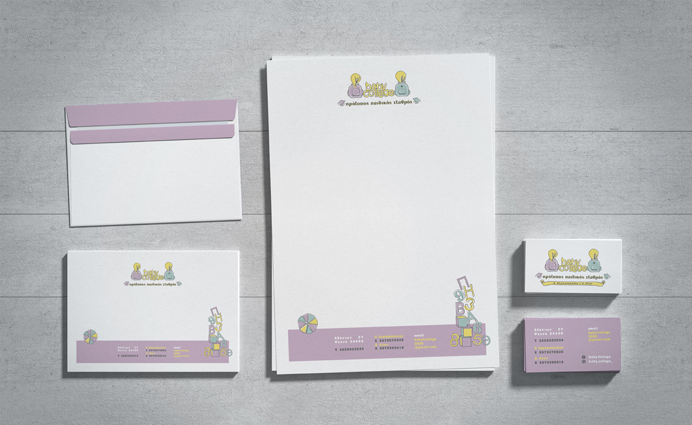
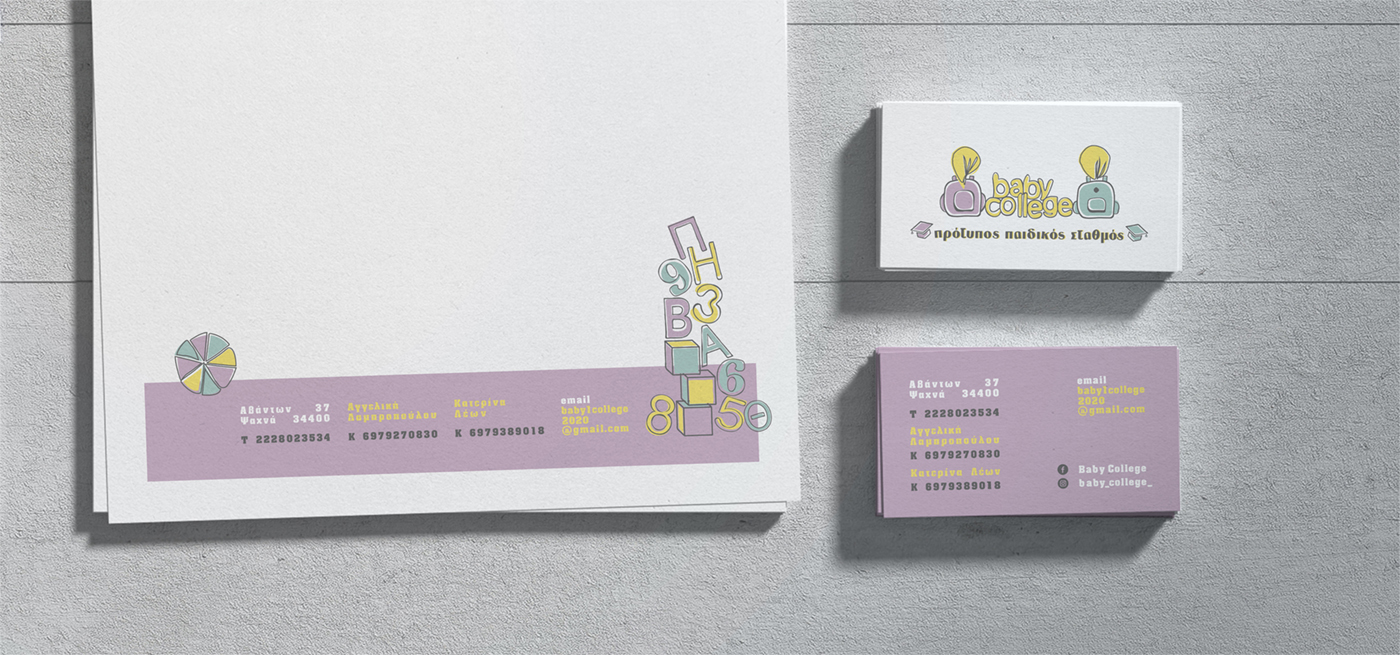
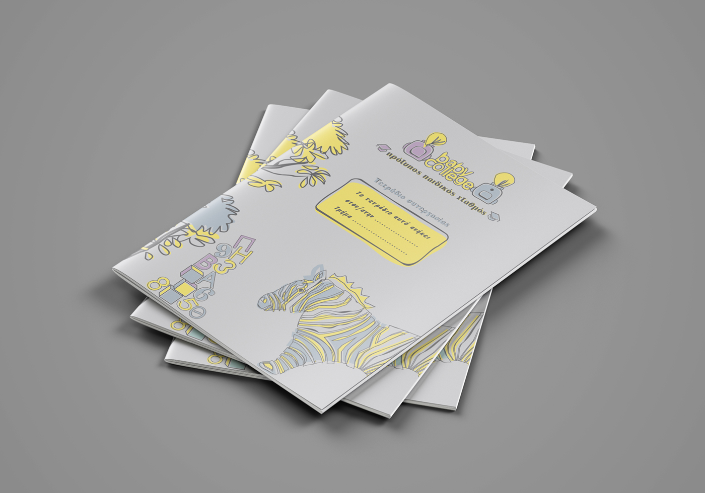
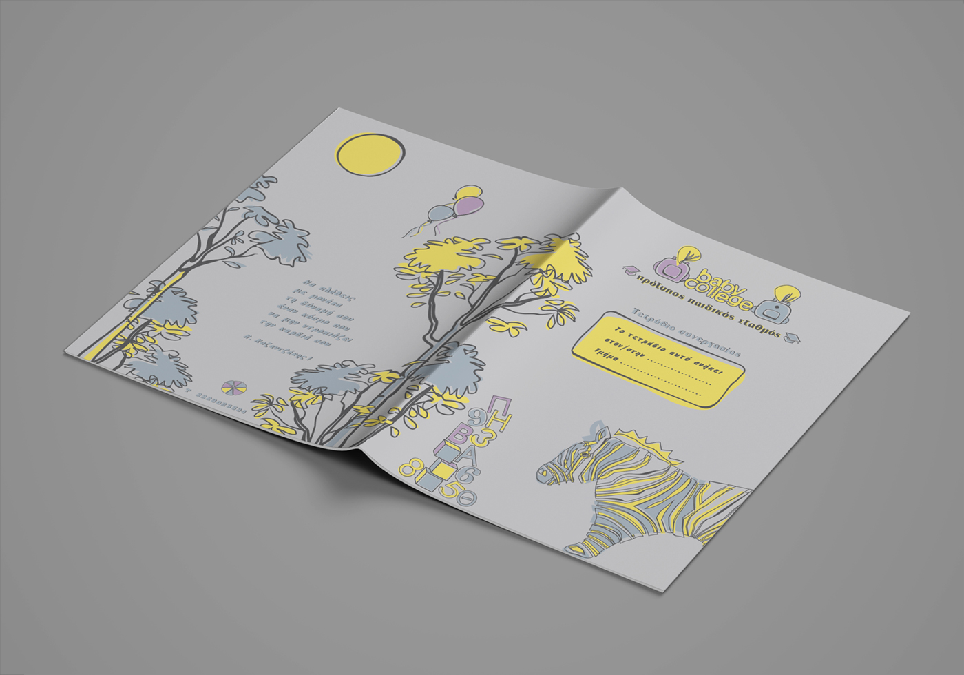
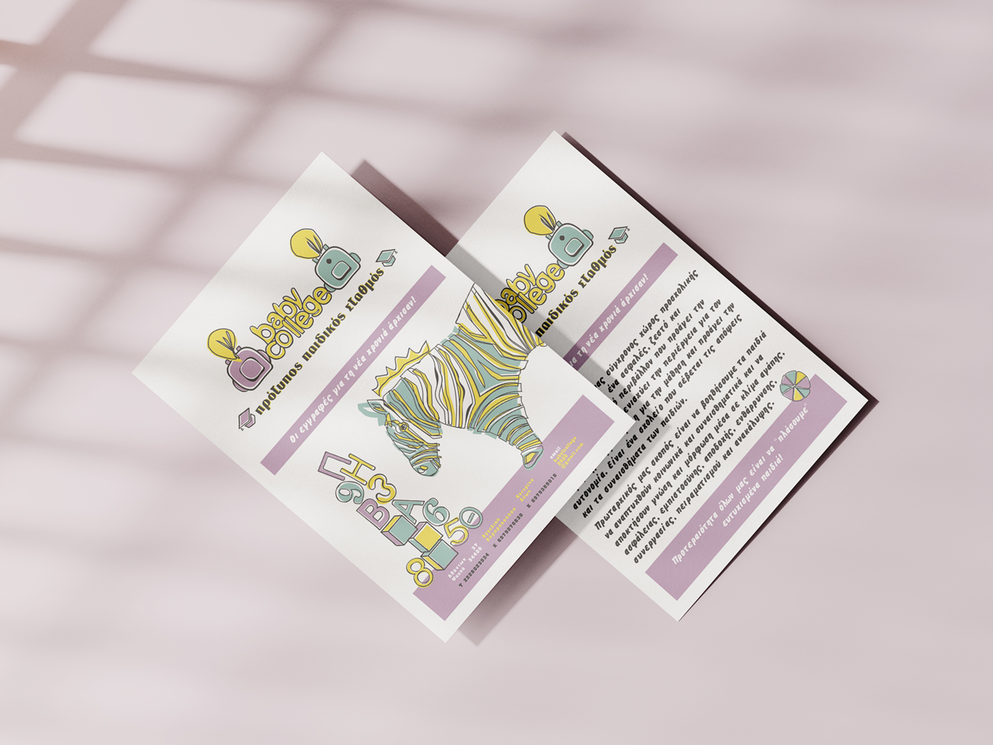
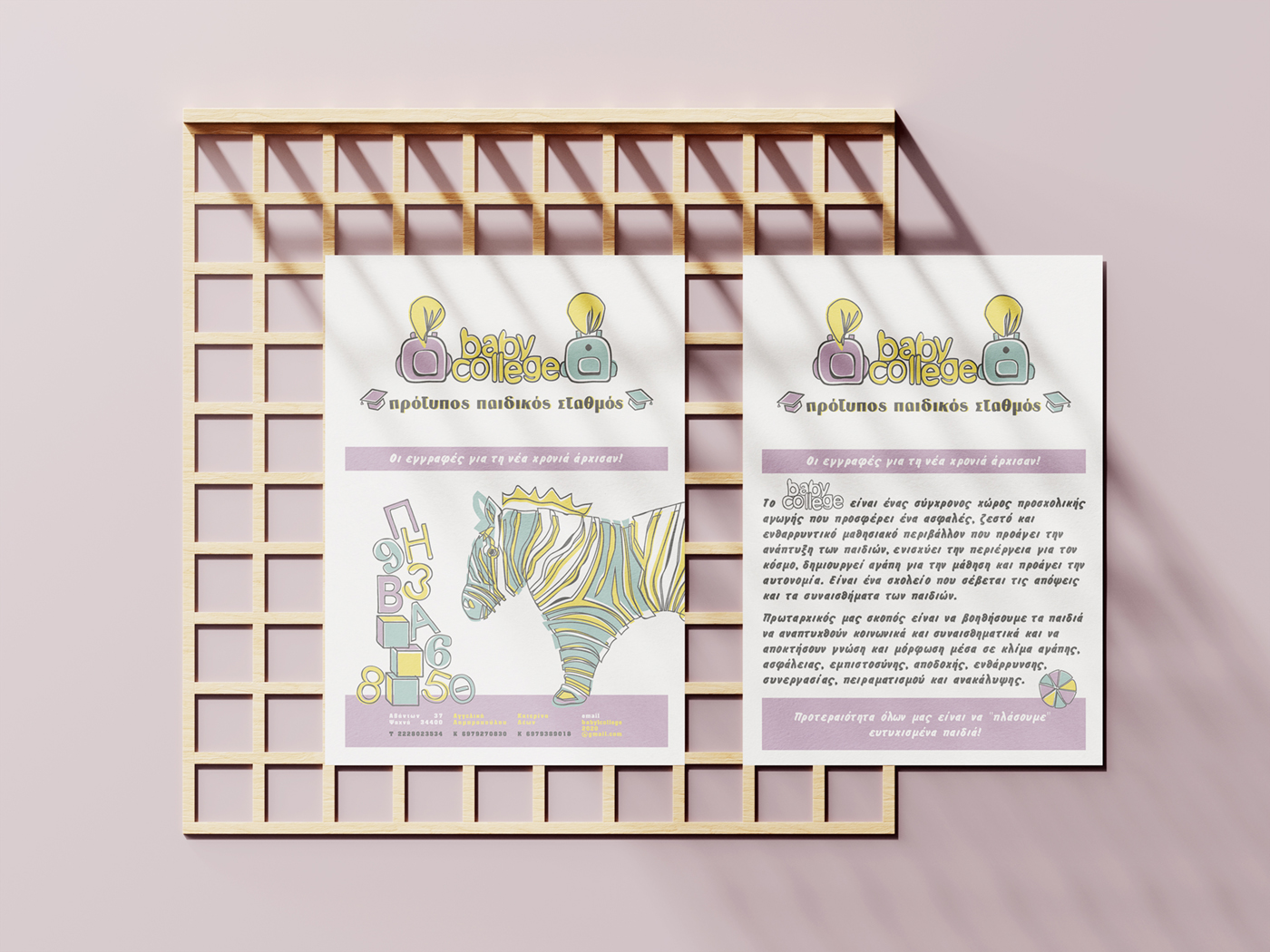
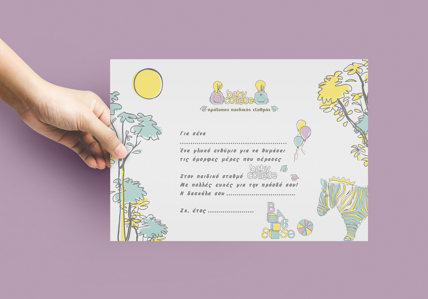
The corporate identity of baby college was developed with a focus on a child‑friendly, dreamy and welcoming aesthetic. The color palette consists of pastel, soft and calm tones, with subtle contrasts that create an atmosphere of warmth, safety and imagination — ideal for a modern preschool environment.
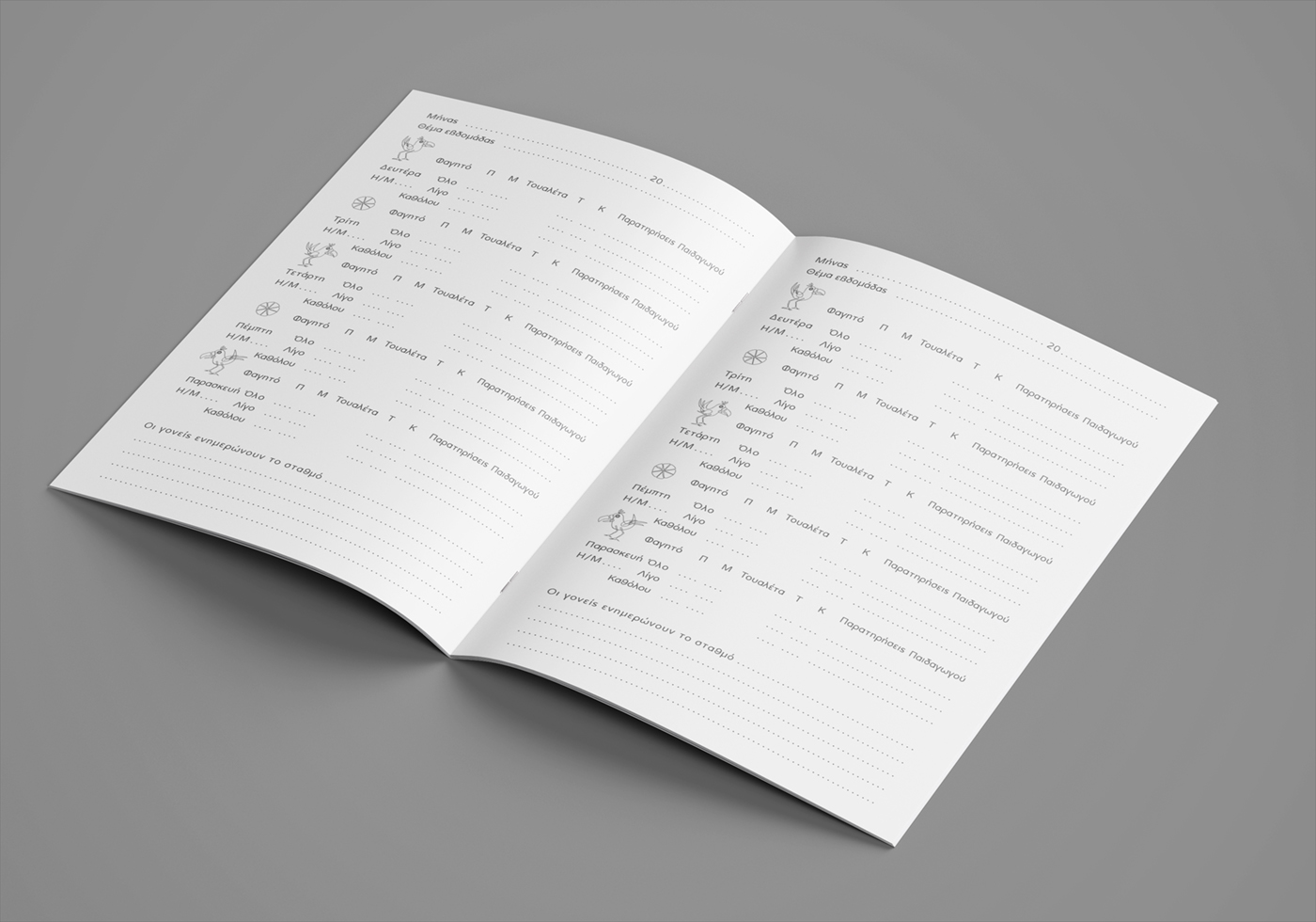
The overall approach is illustrative, featuring charming elements such as animals, trees, numbers, letters, building blocks, balls and balloons, composing a delightful scene inspired by childhood imagination, play and early learning.
The logo symbol depicts two children from behind — a girl with a lilac backpack and a boy with a light‑blue backpack — looking forward, symbolizing growth, progress and their future graduation journey. Between them stands the preschool’s name, rendered in a free‑flowing, custom childlike typeface, reinforcing the tender and whimsical character of the identity.
At the bottom of the logo, on both sides of the descriptive wording that defines the educational nature of the preschool, appear two graduation caps, completing the conceptual narrative of learning, development and the joy of a child’s first educational experience.