Logo Design – Brand Identity, Mary D Luxury Boutique, Chalkida
Naming – Logo Design – Symbol Design – Brand Identity – Creative Applications
© 2020 Knowledge Game Design Studio, NIKOLAOS ZISIS
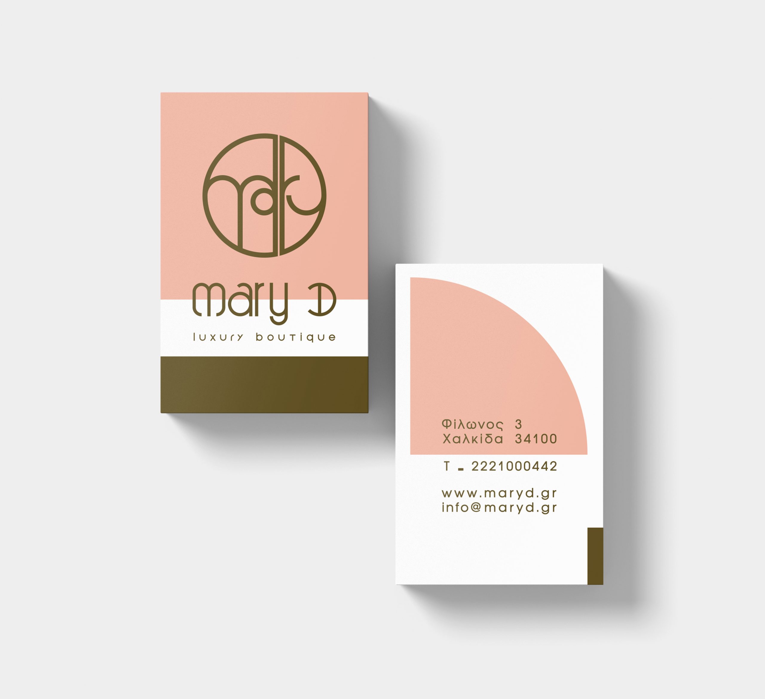
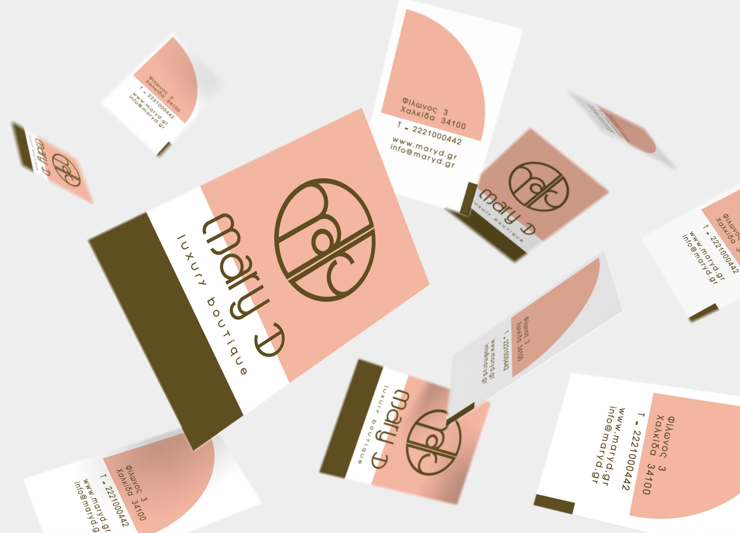
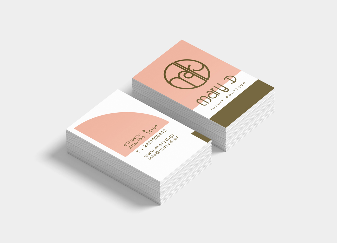
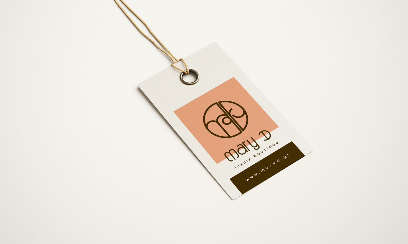
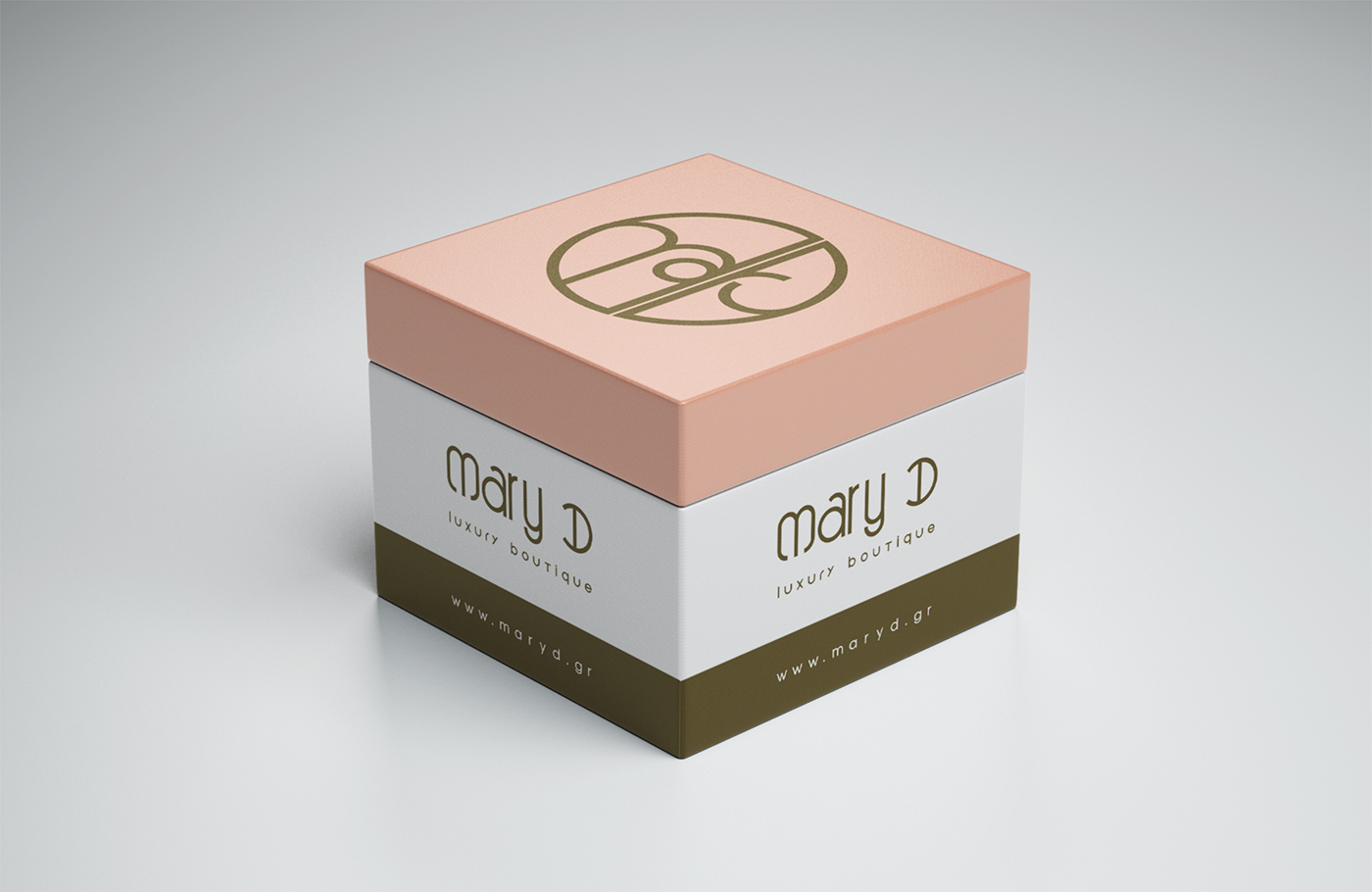
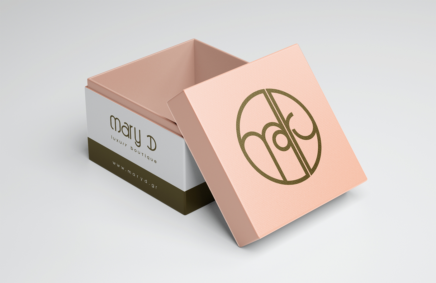
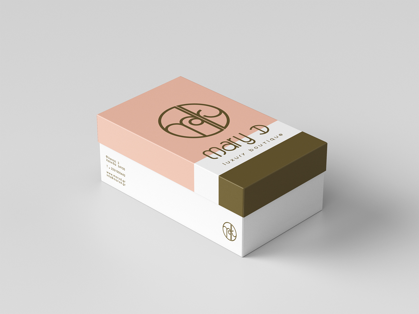
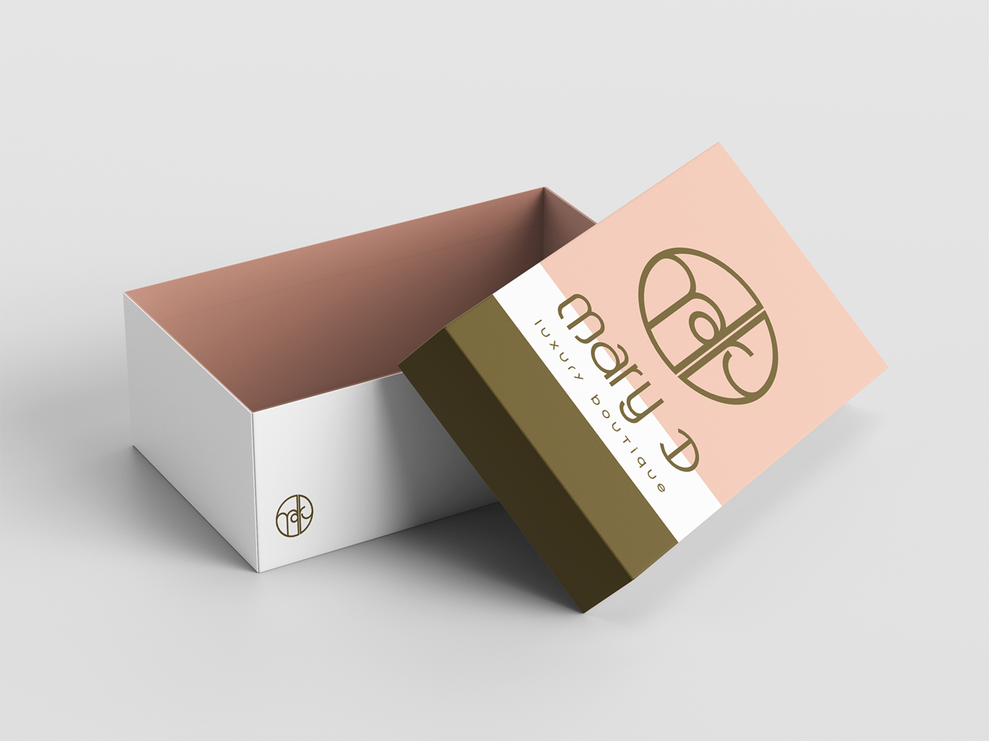
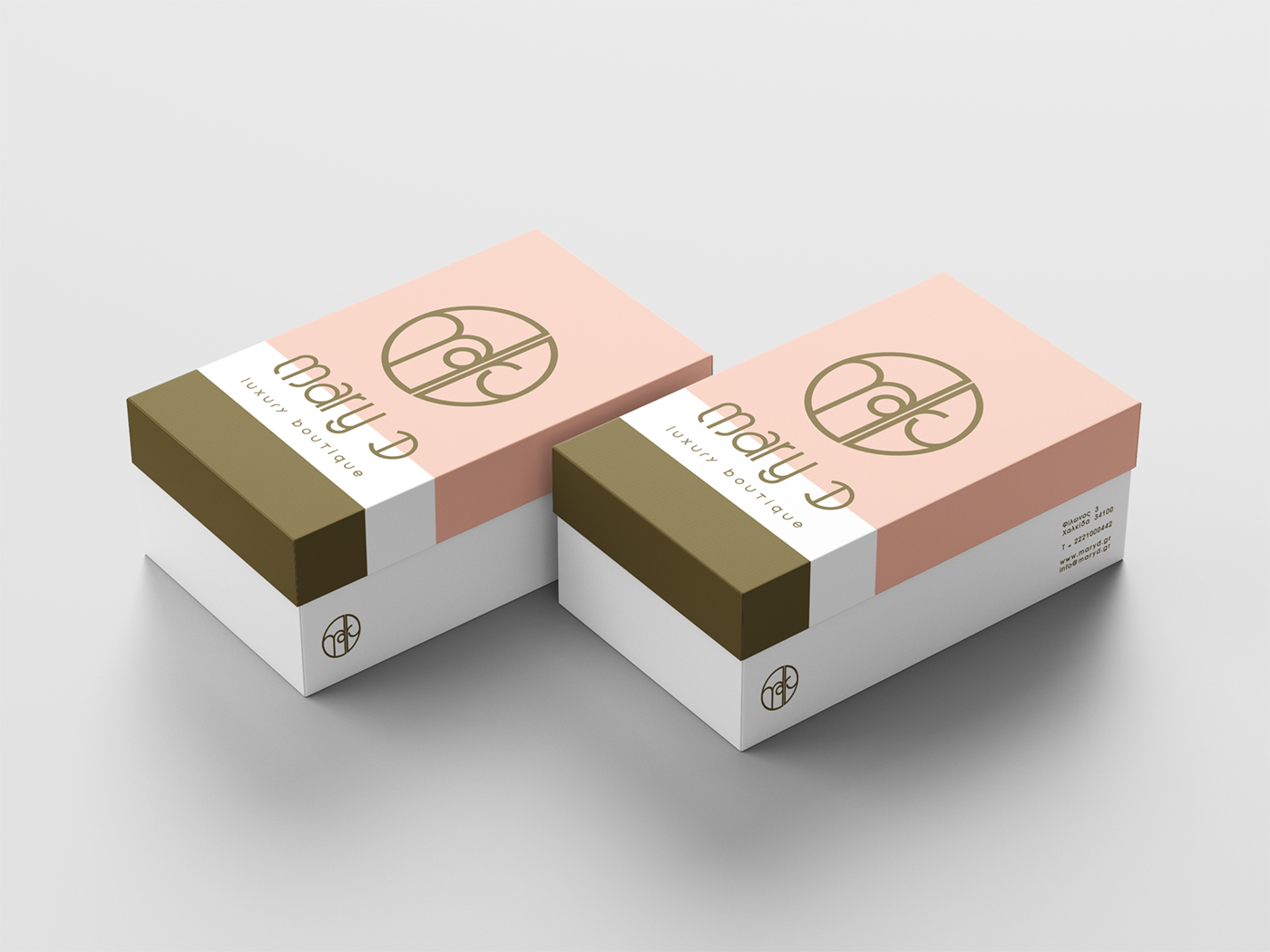
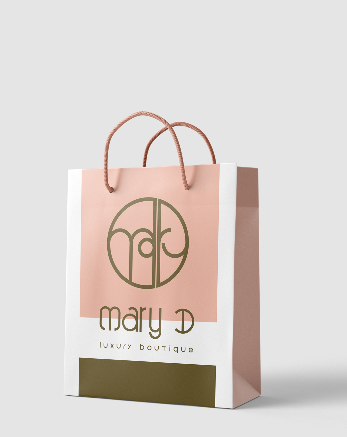
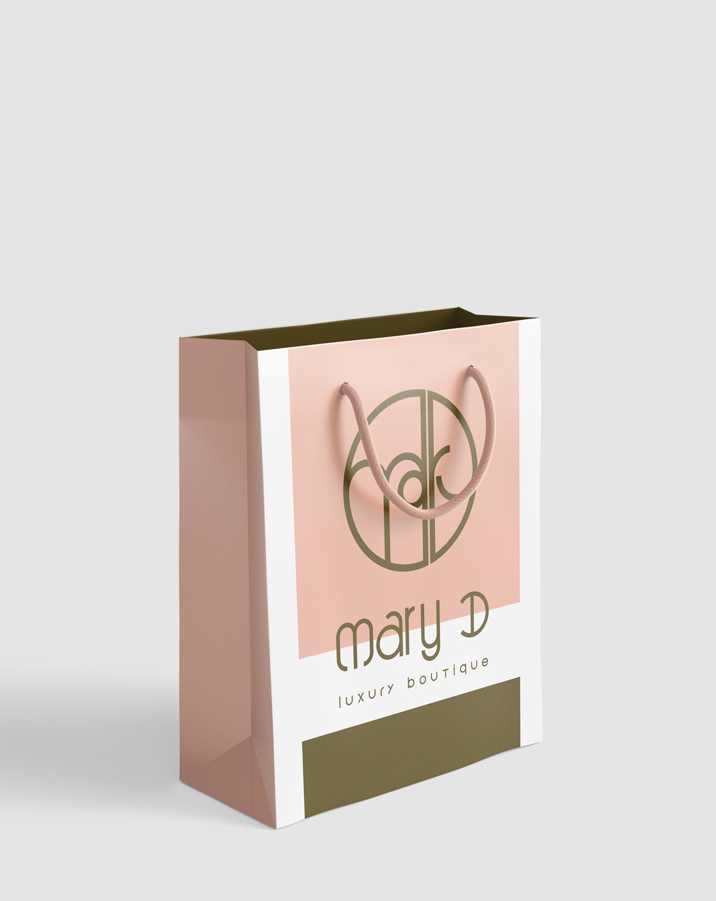
The name “Mary D” was developed as a refined nod to the style of the 1960s, while also reflecting the owner’s identity: her first name, Mary, combined with the initial of her surname, D. The logo, enclosed within a circle, is formed by a custom letter composition where “mary” visually connects to an implied “D,” emerging subtly through the structure of the ry syllable.
Beneath the symbol, a custom abstract luxury typeface spells out “mary D,” with “luxury boutique” completing the visual hierarchy. The color palette — deep bronze and dirty pink — reinforces the brand’s premium, feminine, and contemporary character, expressed consistently across all identity applications.