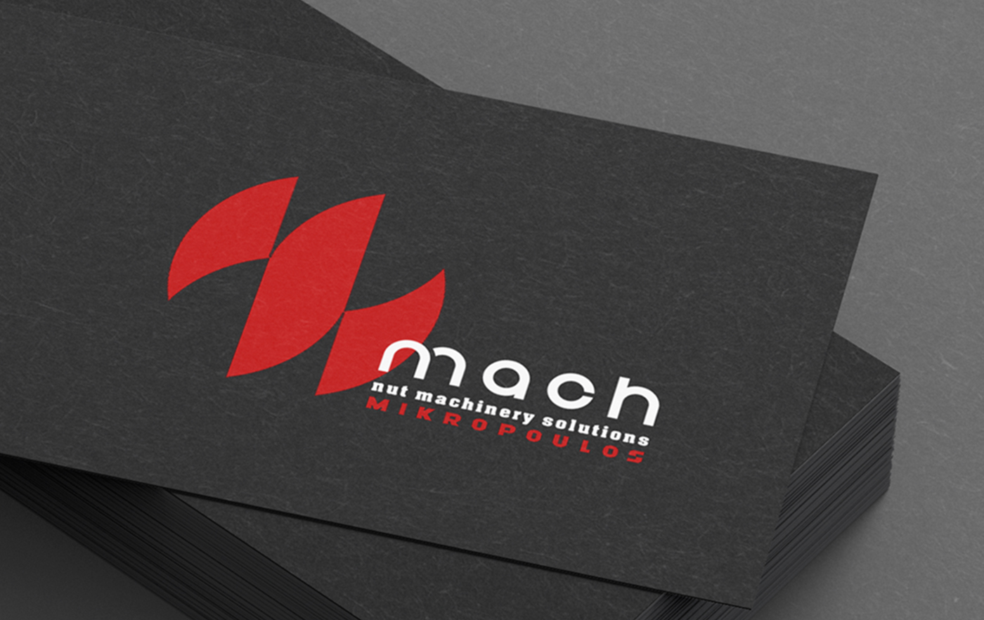
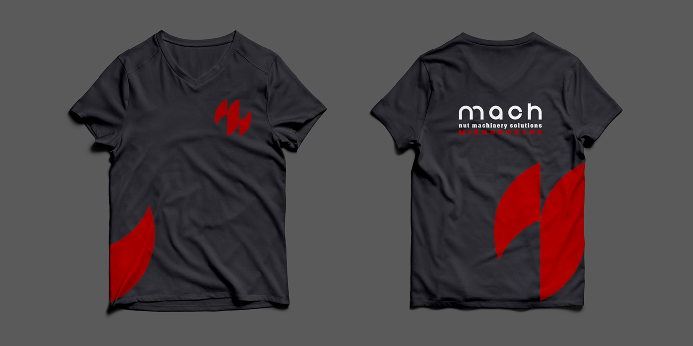
Naming – Rebranding Study – Logo Design, mach, nut machinery solutions MIKROPOULOS, Thessaloniki
Naming – Rebranding Study – Logo Design
© Knowledge Game Design Studio, NIKOLAOS ZISIS
The company specializes in the design, construction and installation of industrial machinery for nut processing. This expertise became the core reference for creating an abstract symbol that resembles a processing‑machine component while simultaneously suggesting the letter m from the founder’s surname and the initial of the company name. The wordmark combines two typefaces: a custom minimal sans serif and a serif, achieving a balance between modern technical precision and corporate reliability. The color palette — dark grey, red and white — reinforces the industrial character, accuracy and dynamic identity of the brand.