

Rebranding Study – Logo Design – Corporate Identity, alpha thessaloniki LIMO TAXI transfers, Thessaloniki
Rebranding Study – Logo Design – Brand Mark
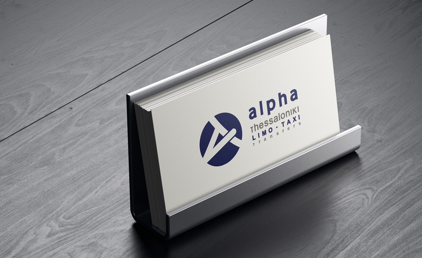
Corporate Identity – Creative Applications
Website Creative Direction
In this rebranding project, the need for simplification, abstraction, and a fresh contemporary identity was essential. The previous logo was highly descriptive, featuring the White Tower, Byzantine lettering, and gradients, elements that limited its modern usability and clarity.
The primary goal was to simplify the mark while respecting the city’s historical character and maintaining strong brand recognition through key symbolic elements. Our proposal focused on designing a lettermark “A” with subtle references to Byzantine typography, preserving the cultural connection to Thessaloniki but expressed in a minimal, modern form.
The A is placed within a circular structure, abstractly reminiscent of a traffic system or road bridge, symbolizing movement, transfer and urban flow. The letter intersects the circle at three points, opening the shape and creating a dynamic, contemporary visual identity.
The color palette retains the brand’s deep navy blue, complemented by subtle grey accents in the wordmarks. The typography is sans serif, with carefully adjusted weights and spacing to ensure the information remains clear, legible, and memorable across all applications.