
Logo Design – Label Design, oneirospito FARM, Evia
Logo Design – Brand Mark – Corporate Identity
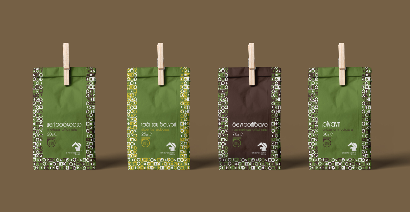
Label Design – Creative Applications
© Knowledge Game Design Studio, NIKOLAOS ZISIS
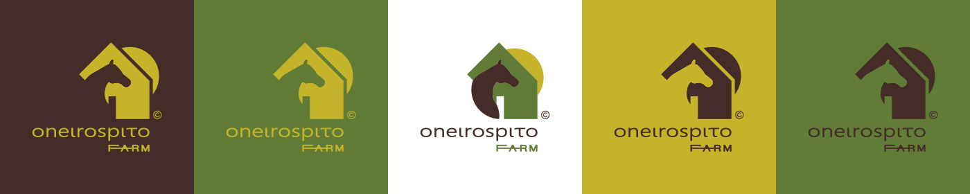
For the design of this specific logo–mark, an abstract, stylized composition was chosen, combining the head of a horse, a farm hut, and a sun, forming the pictorial symbol. This symbol can also function independently, without the logotype, while still characterizing the brand.
For the logotype, lowercase characters of a sans serif typeface are used, combining Latin and Greek letters to correspond to the naming without losing meaning and to ensure clear visual distinction.
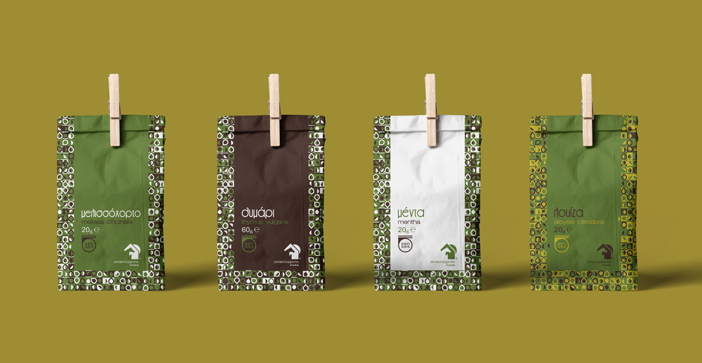
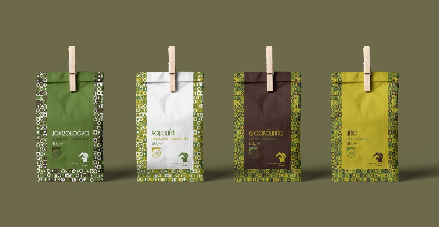
Both the corporate identity applications and the packaging and label applications use a broad, combinational color palette (mustard, green, brown–aubergine, and white) to visually differentiate the herbs offered.
Extensive use is also made of the graphic pattern depicting geometric leaves, which change color, repeat, and vary in direct connection to the herb products being promoted. This pattern is applied both to the corporate identity and to the packaging.
For the naming labels of the products — both their common, familiar names and their scientific denominations — distinctive typefaces are used to capture the consumer’s attention on the shelf