Logo Design – Brand Identity, Olea resort, Vourvourou Halkidiki
Naming – Logo Design – Symbol Design – Brand Identity
© Knowledge Game Design Studio, ΝΙΚΟΛΑΟΣ ΖΗΣΗΣ
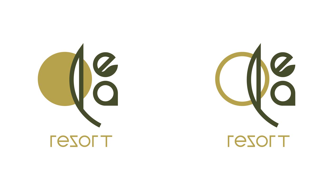
The naming and brand identity design for Olea Resort draw inspiration from its unique setting: a seaside landscape surrounded by an expansive olive grove. The name “Olea” was proposed as a direct reference to the olive tree, a defining element of the location and the guest experience.
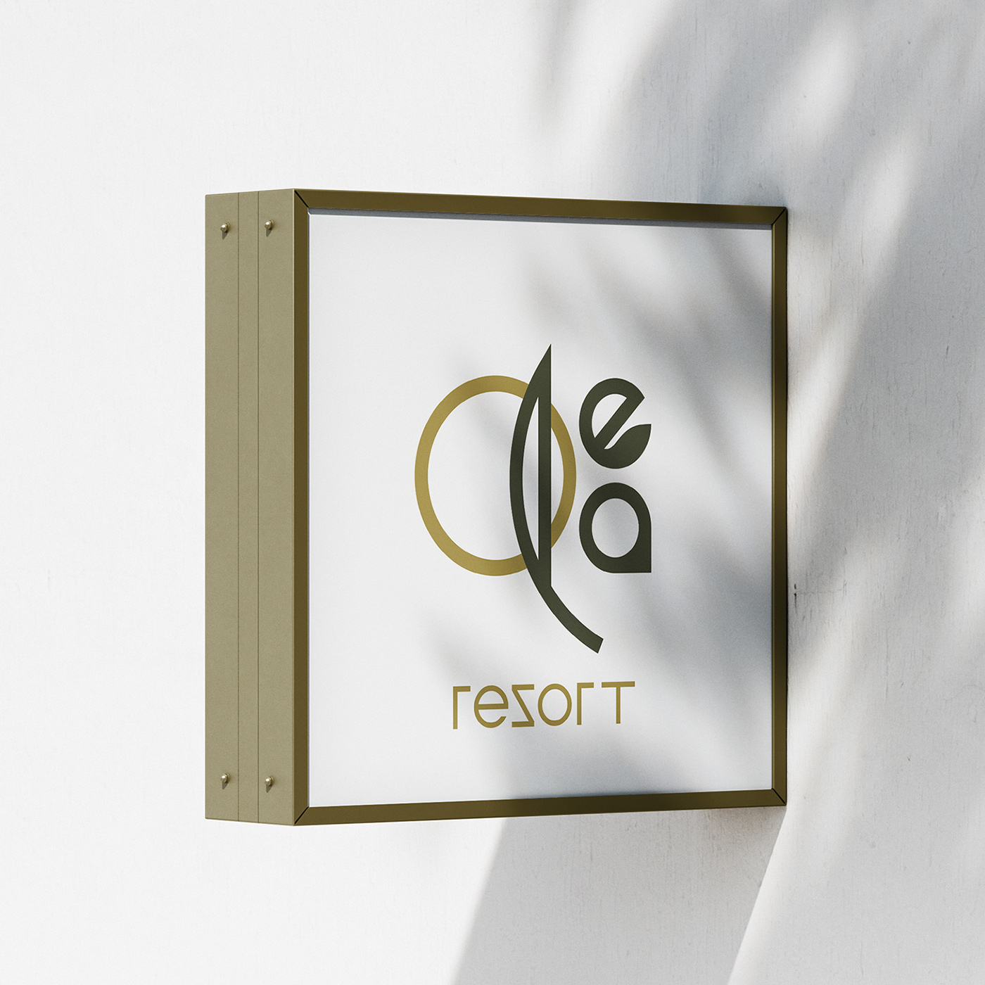
In the logo, each letter of the wordmark carries symbolic meaning: the O represents the sun, the l forms an olive leaf, the e suggests a small leaf shape, and the a is rendered in an abstract, organic form. The accompanying word “resort” beneath the Olea wordmark completes the custom typographic design. The color palette combines olive‑green hues with a golden‑bronze tone inspired by sunlight.
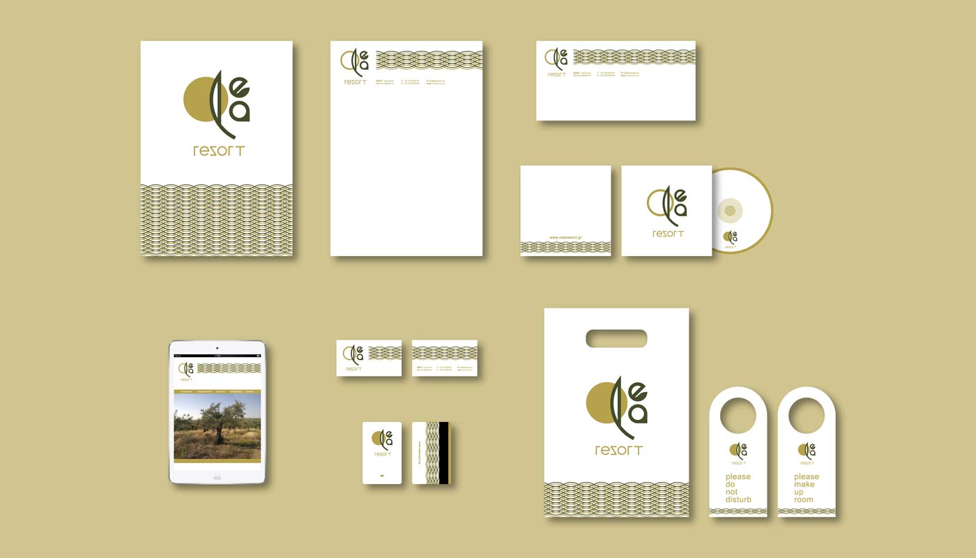
The brand identity is further enriched with an abstract, repeating wave pattern in the same color scheme, applied across various print and digital materials to enhance consistency and visual character.