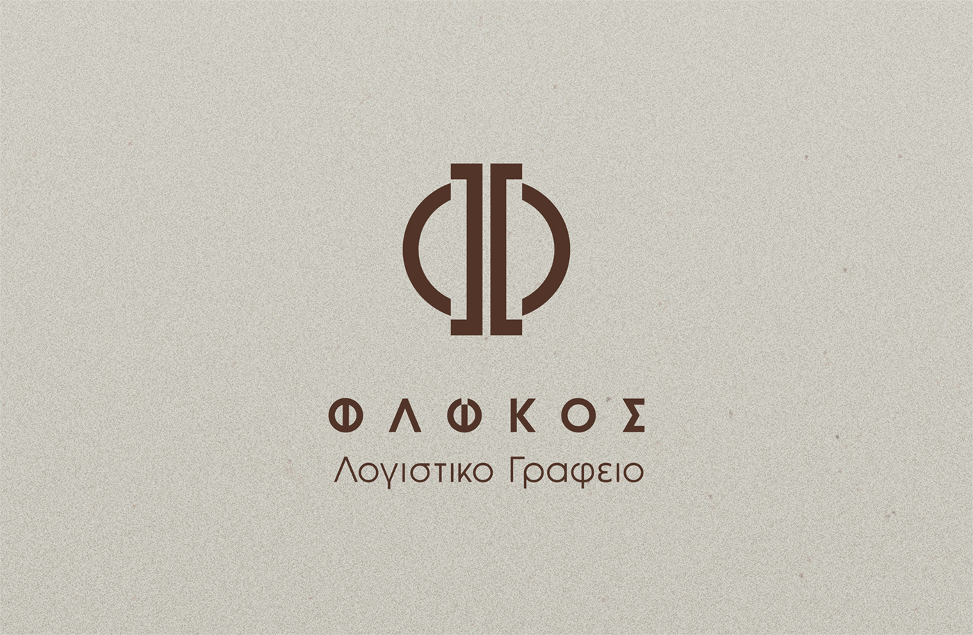
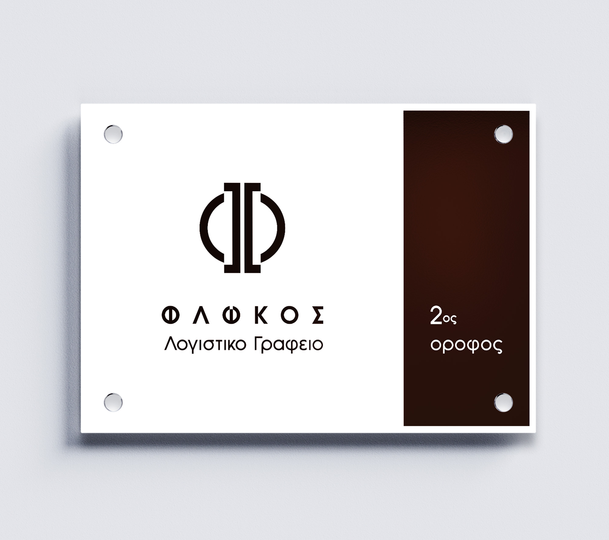
Logo Design – Corporate Identity, FLOKOS Accounting Office, Chalkida
Logo Design – Corporate Identity
© 2019 Knowledge Game Design Studio, NIKOLAOS ZISIS
For the logo design, the goal was to create a strong, abstract capital “F”, derived from the name Flokos. The visual references for shaping the monogram were the symbols of the euro (€) and the dollar ($), reflecting the financial and accounting nature of the office.
The wordmark beneath the “F” is rendered in a custom serif typeface, combining uppercase and lowercase elements to convey solidity, professionalism, and authority.
The color application of the logo—and consequently the entire corporate identity—is monochromatic, dominated by dark brown on a white background, creating a clean, stable, and trustworthy visual presence.