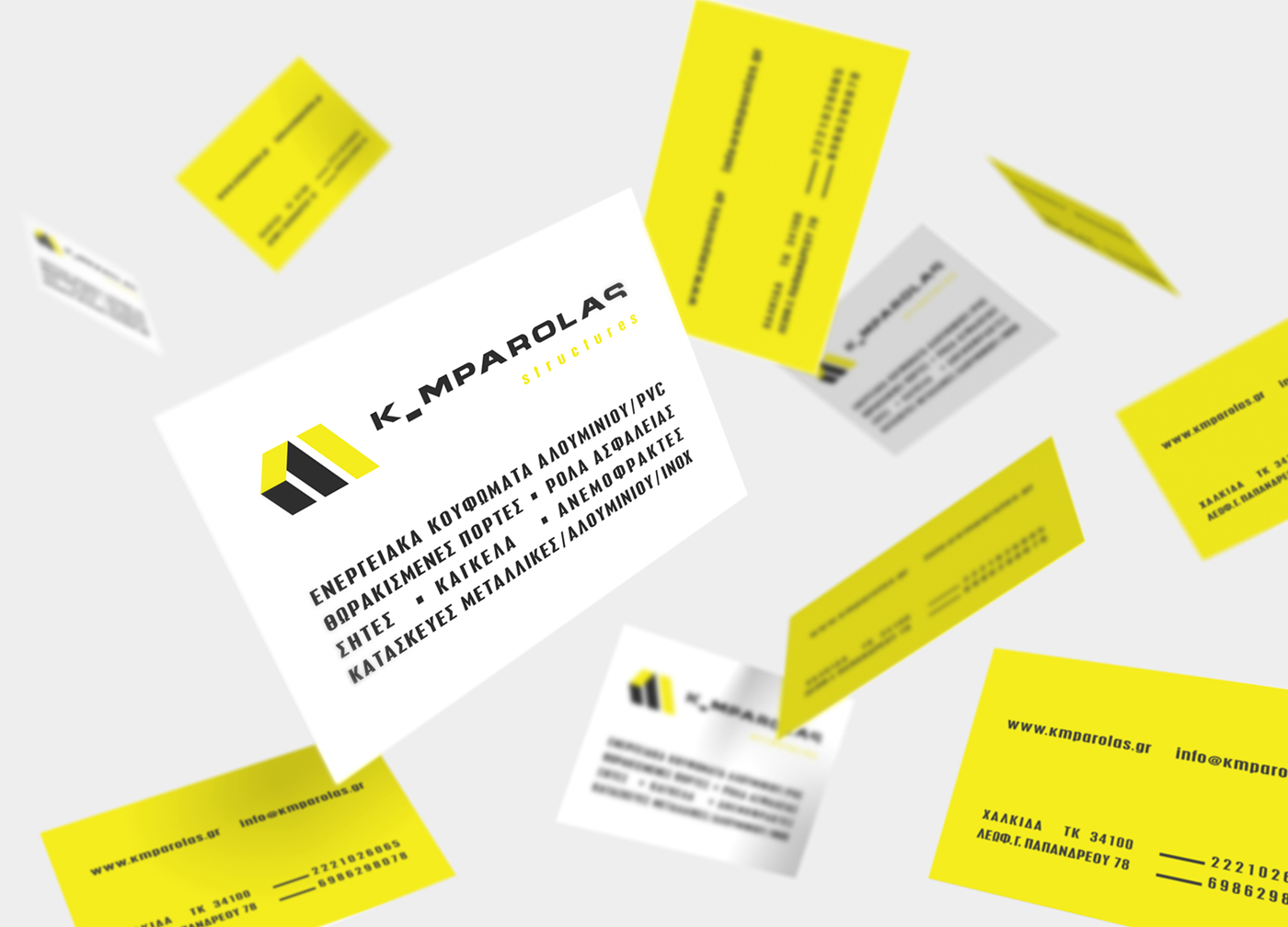
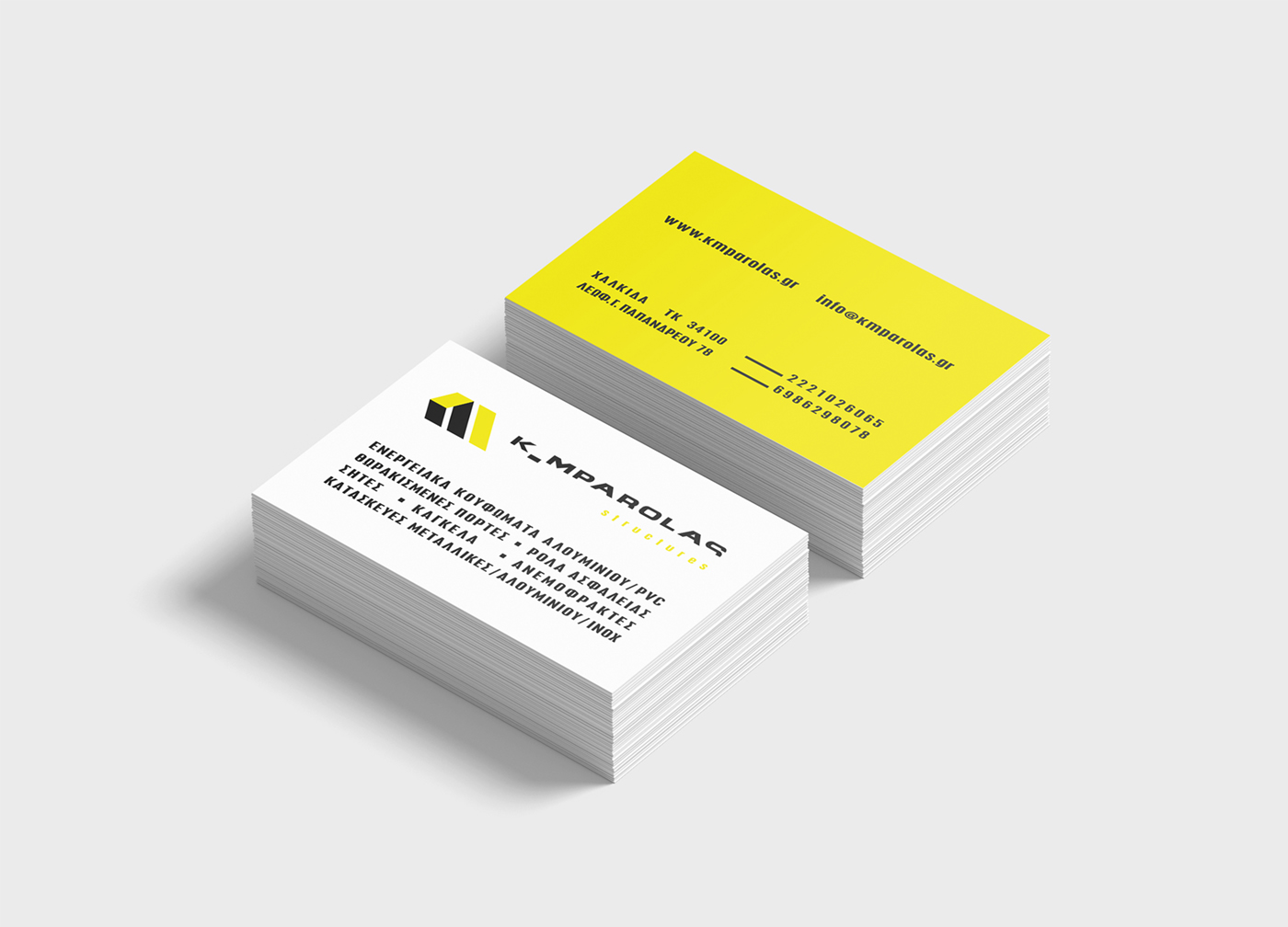
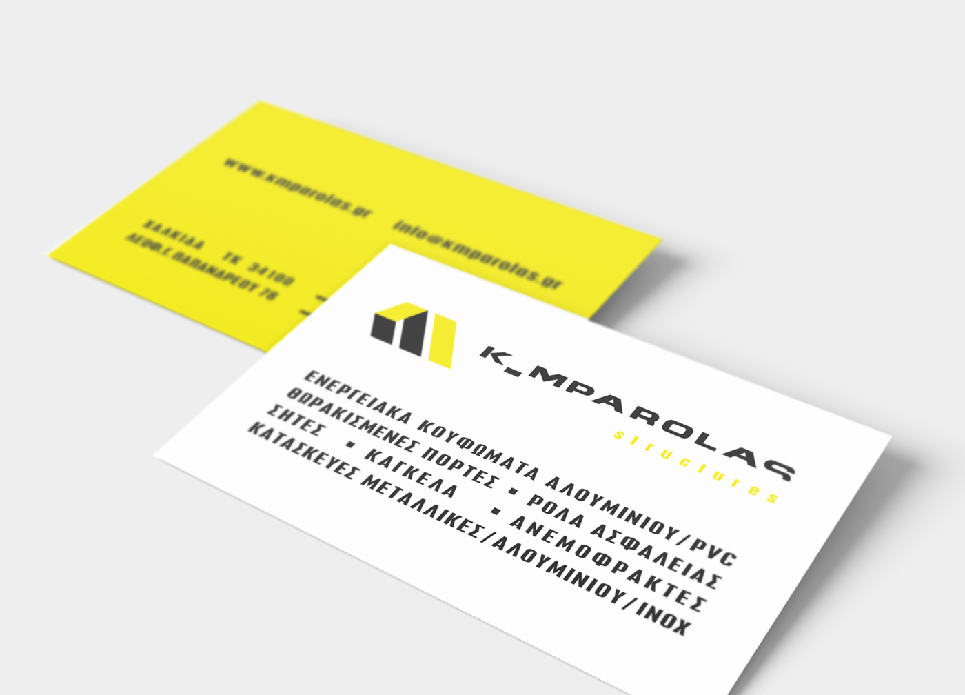
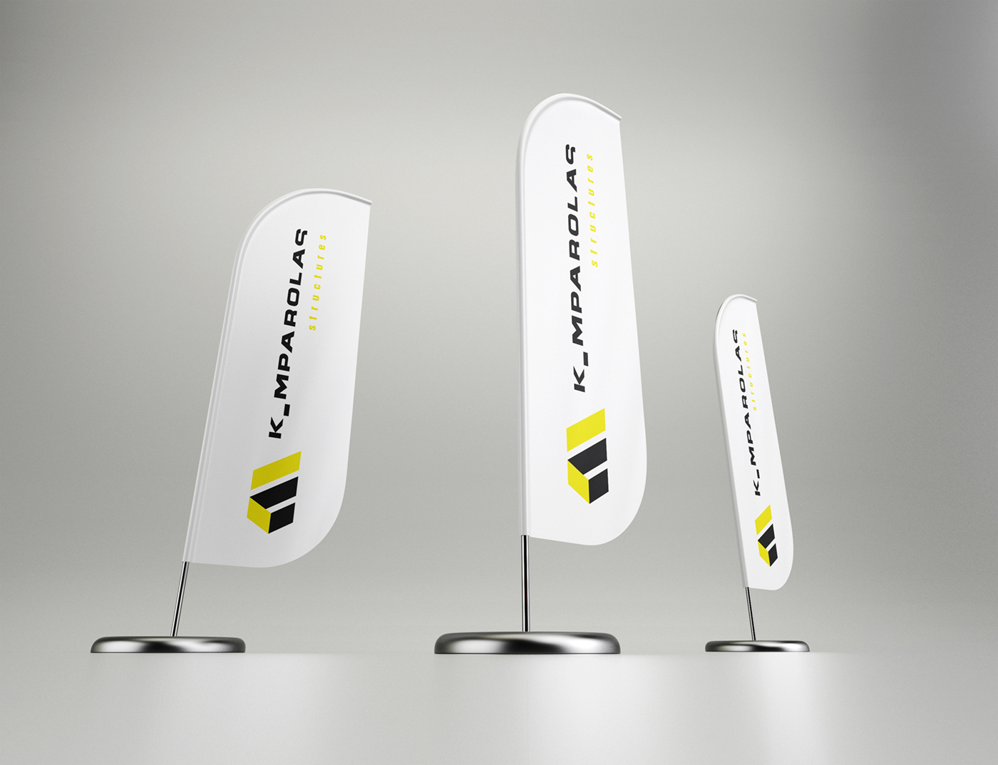
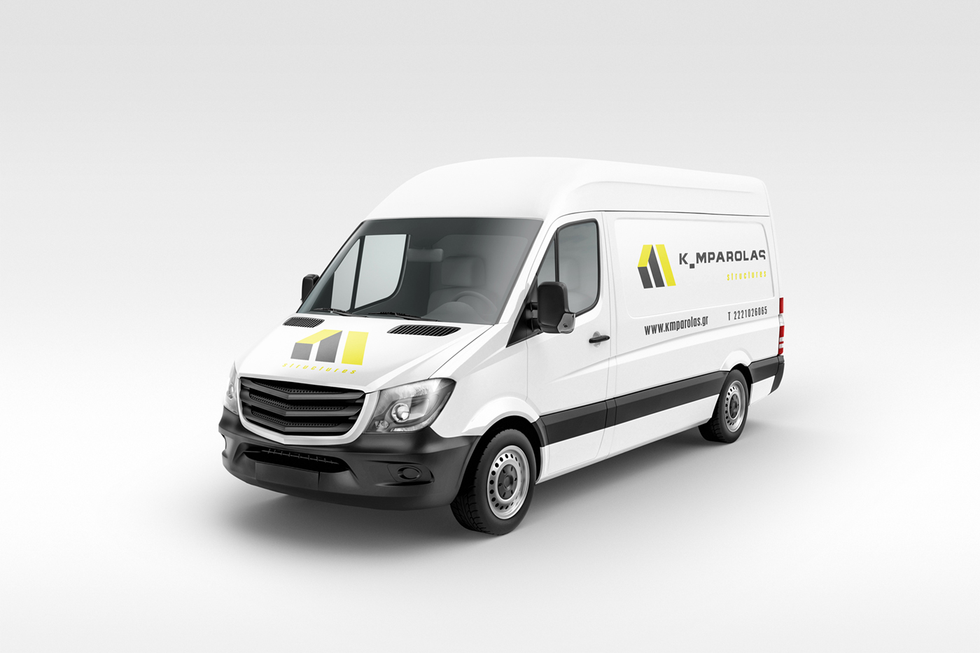
Logo Design – Corporate Identity, K _ MPAROLAS structures, Chalkida
Logo Design – Corporate Identity
Slogan – Copywriting
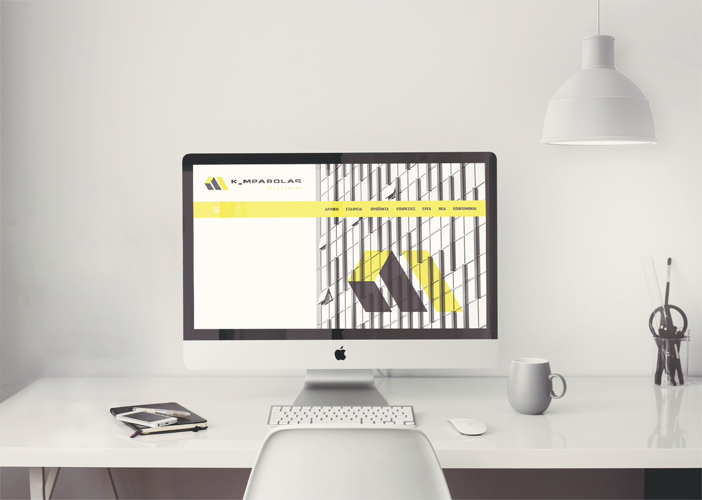
Creative Web Design
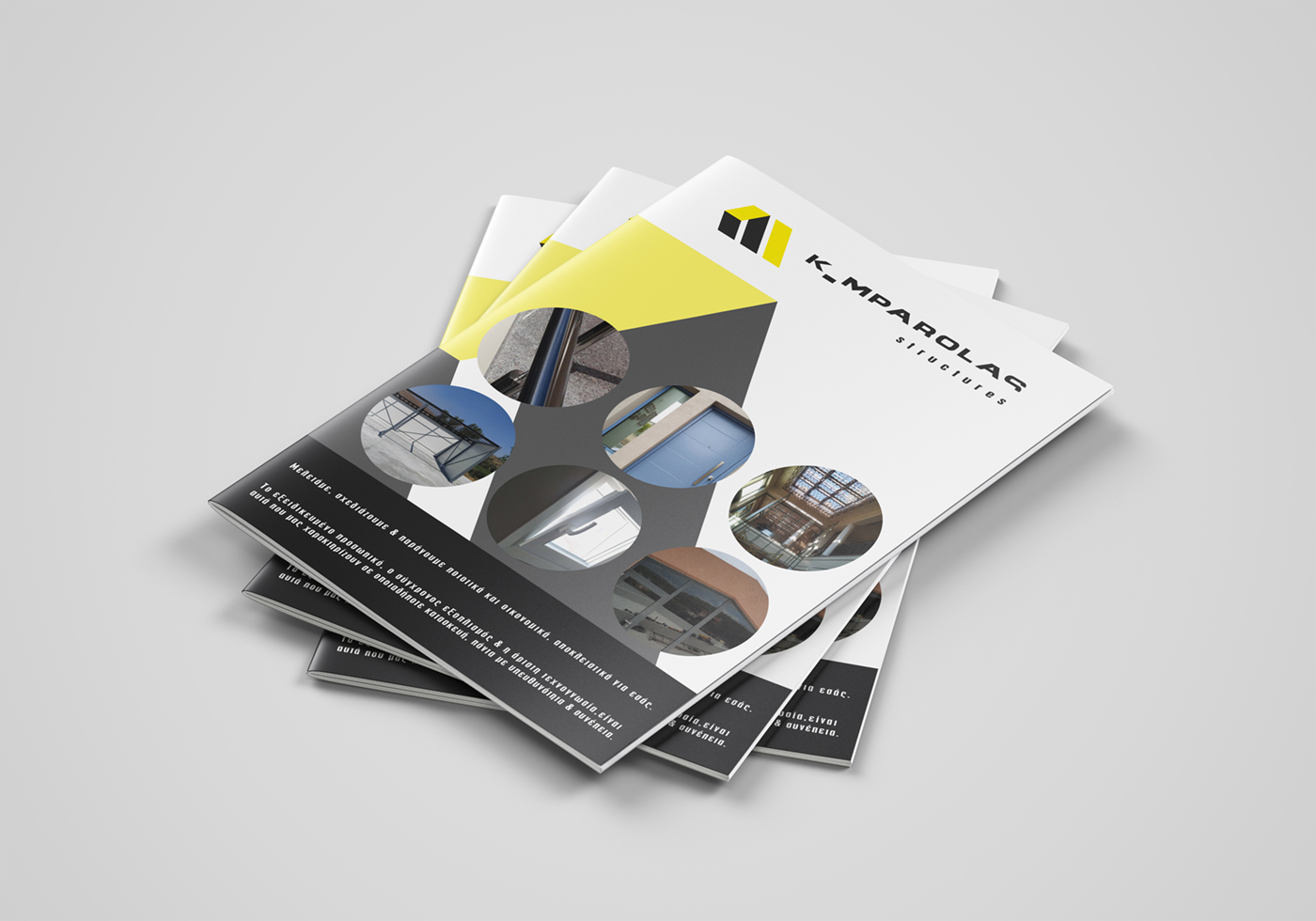
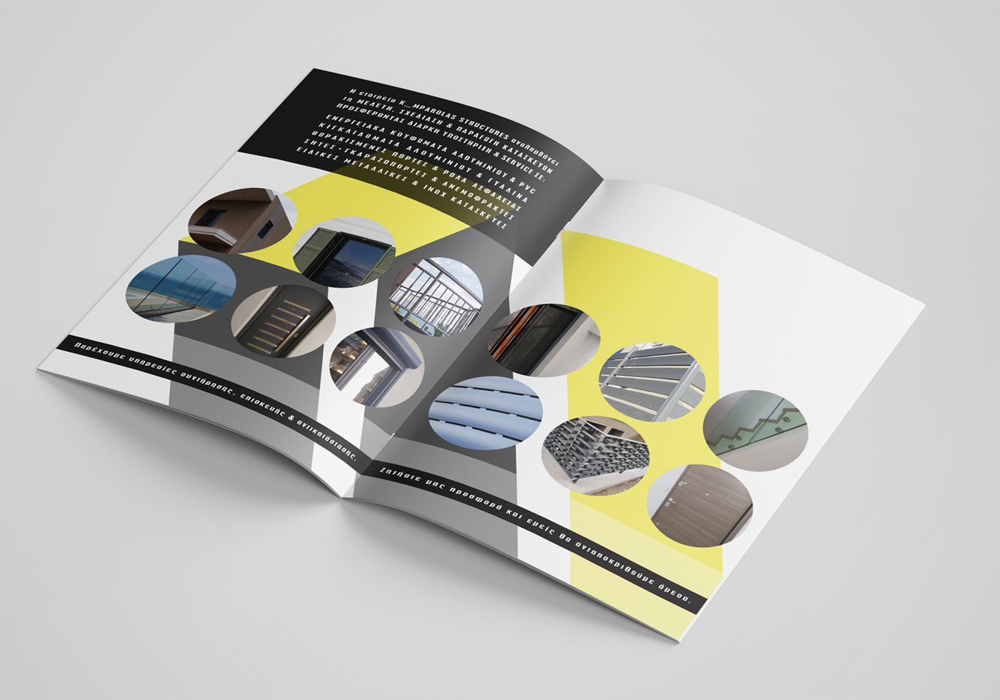
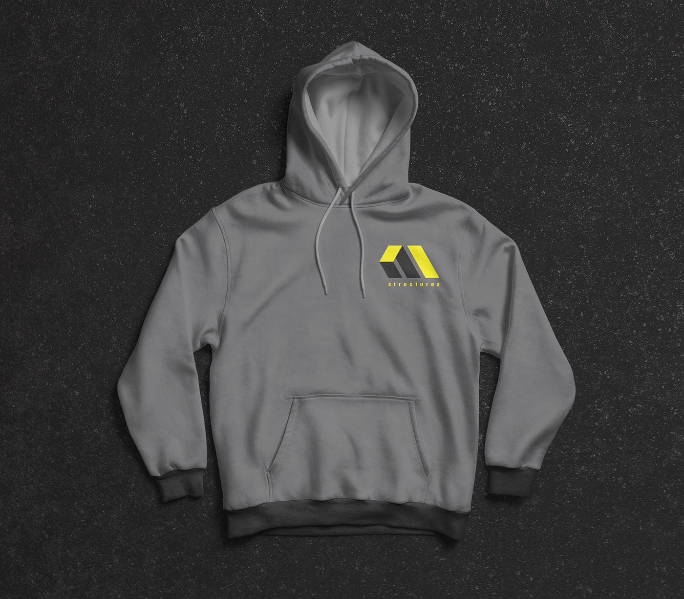
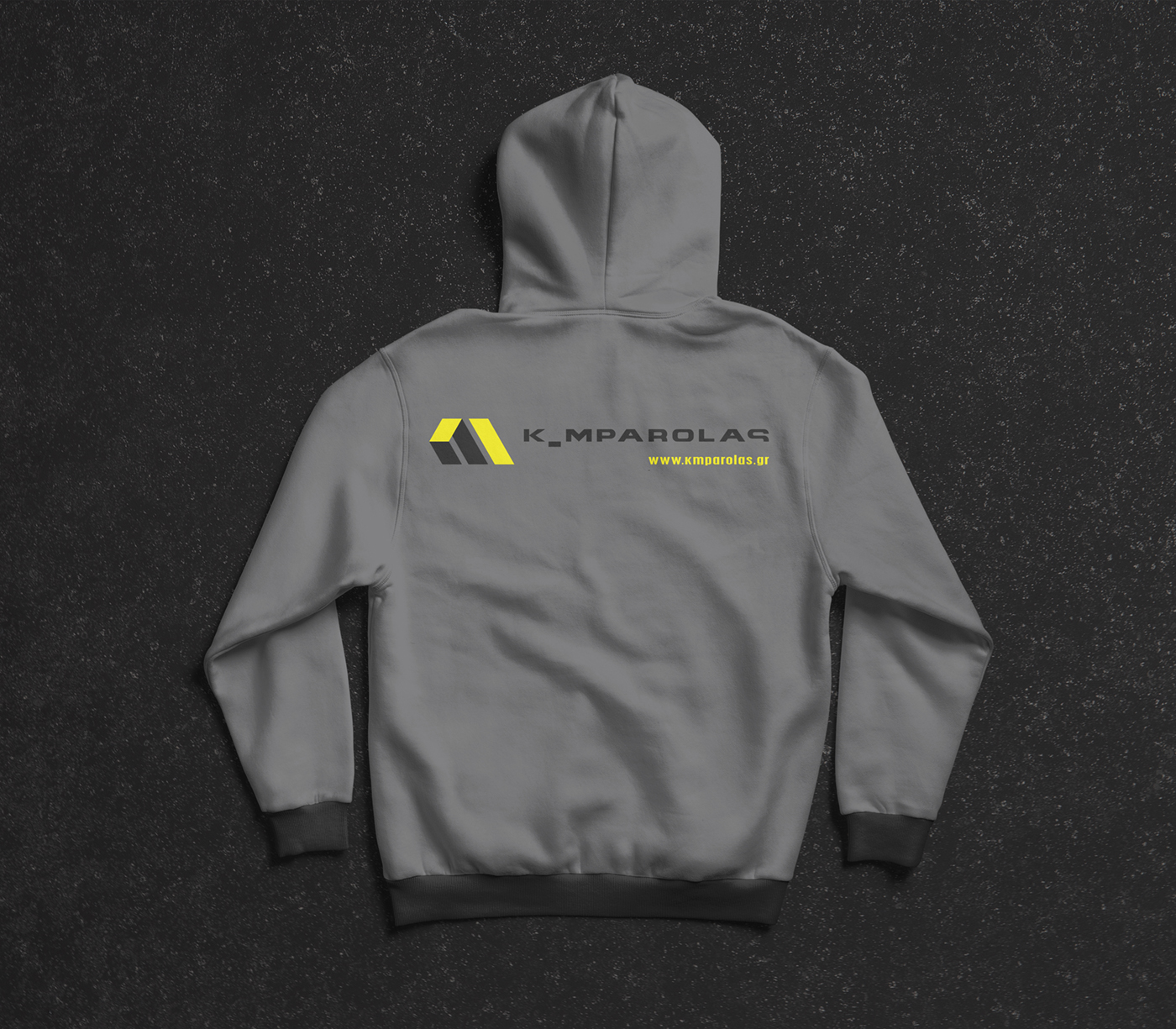
The corporate identity for K _ MPAROLAS Structures is built on a modern, solid and construction‑driven visual language. The company’s colors — dark grey and yellow — express stability, technical precision and energy, aligning with the field of metal structures.
The logo design draws inspiration from the initials K and M, shaped in a way that resembles abstract, folded metal constructions, directly referencing the company’s core activity. The monogram conveys structure, durability and technical consistency.
The supporting wordmarks are set in sans serif typefaces, reinforcing the clean, contemporary and professional character of the identity. The overall approach creates a unified and recognizable brand presence across all communication materials.