Open Competition for the Logo Design of the Lombardy Psychologists Association — Milan, Italy (Second Proposal)
Logo Design – Symbol Design – Brand Identity
© Knowledge Game Design Studio, ΝΙΚΟΛΑΟΣ ΖΗΣΗΣ
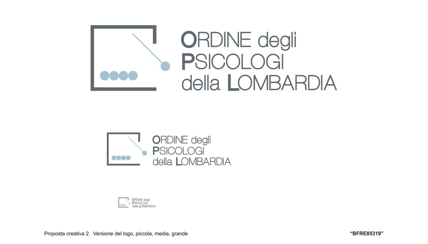
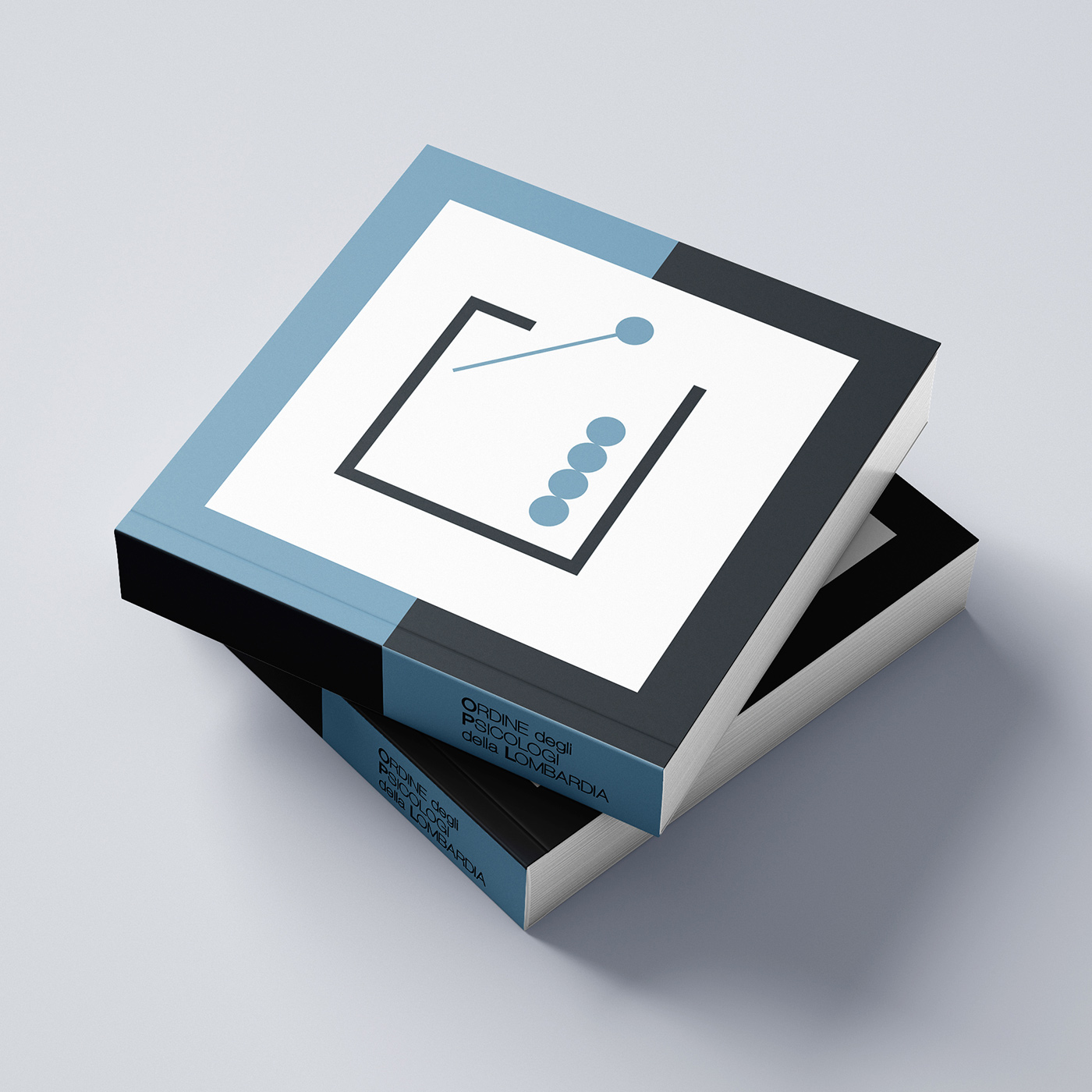
The logo design draws its inspiration from the Newton’s Cradle, the well‑known desktop object with metal spheres often found in psychological practice environments. Its characteristic motion — where one sphere strikes the others and the energy returns — serves as a visual metaphor for the core principles of psychology: interaction, empathy, connection, balance, and continuity.
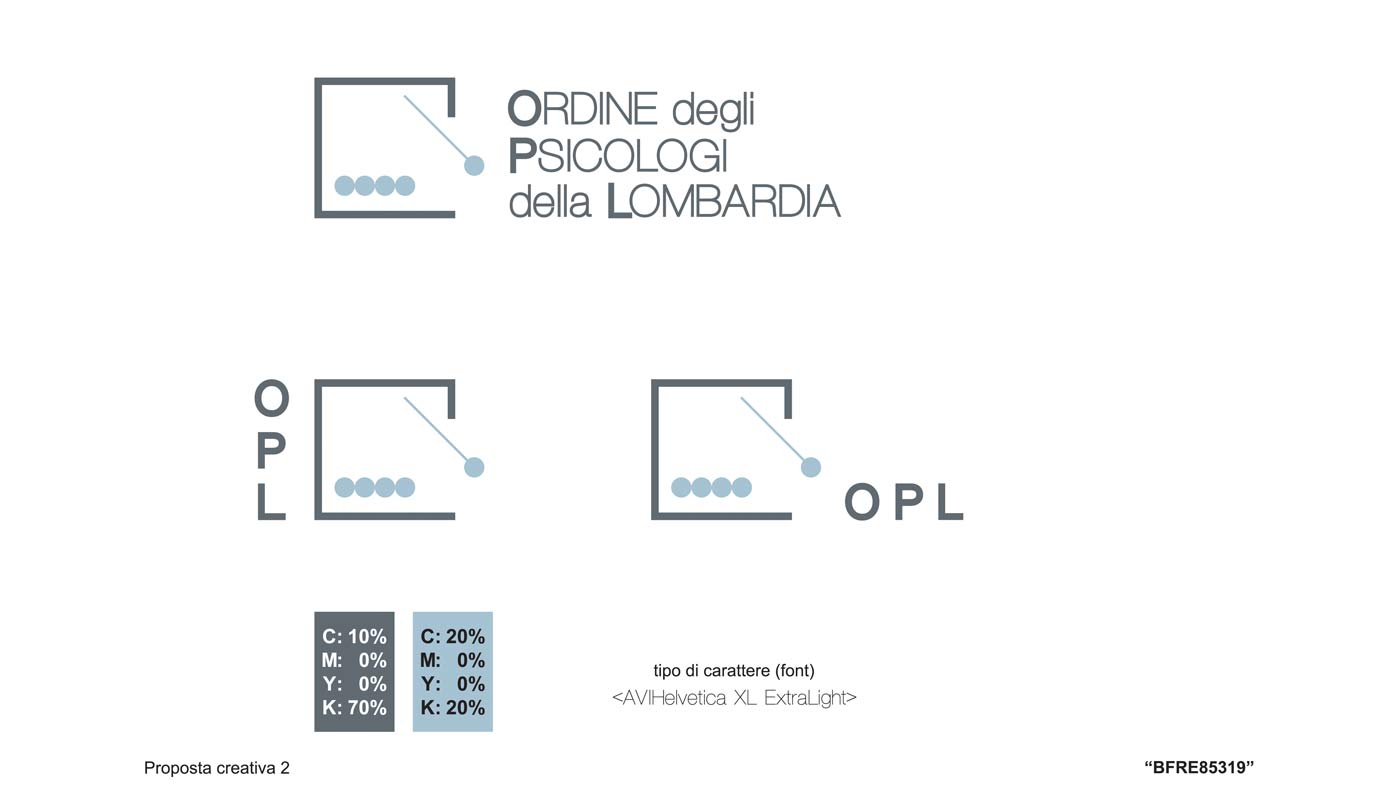
This dynamic is expressed through a clean, contemporary geometric symbol that reflects the flow and relational exchange between individuals. The wordmark is rendered in minimal sans‑serif typography, while the color palette — deep grey and light navy blue — reinforces a sense of calmness, stability, and mental clarity.
The result is a modern, trustworthy, and symbolically rich visual identity that represents the mission of the Lombardy Psychologists Association and the essence of the therapeutic relationship.