Open Competition for the logo and slogan of Drama, as a wine tourism destination (third proposal)
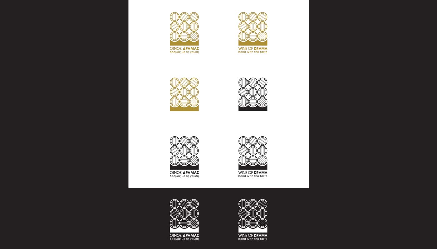
Logo Design – Color Applications – Positive / Negative – Slogan
© Knowledge Game Design Studio, NIKOLAOS ZISIS
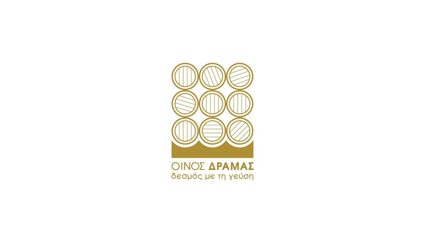
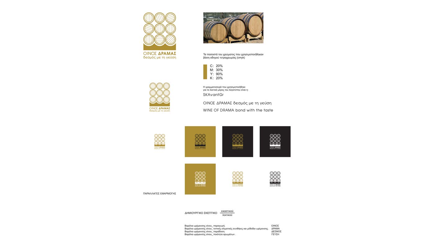
For the third proposal, the inspiration comes from a series of stacked wine‑aging barrels, viewed from their circular fronts, highlighting the wooden staves and structural bases. The logo is composed of three triads of circles, arranged one above the other, forming a solid and recognizable structure that directly references the wine maturation process and the region’s deep-rooted winemaking tradition.
The color palette draws from the tones of aged wooden barrels — warm, earthy hues that convey authenticity, craftsmanship, and a strong connection to the winery environment.
The result is a symbolic and grounded identity that communicates heritage, craft quality, and the wine‑tourism character of Drama.