


Logo Design – Product Brochure Design, Angelo Gelato by SWEET BOND, Attica
Logo Design – Symbol
Corporate Identity – Product Brochure Design
© Knowledge Game Design Studio, NIKOLAOS ZISIS
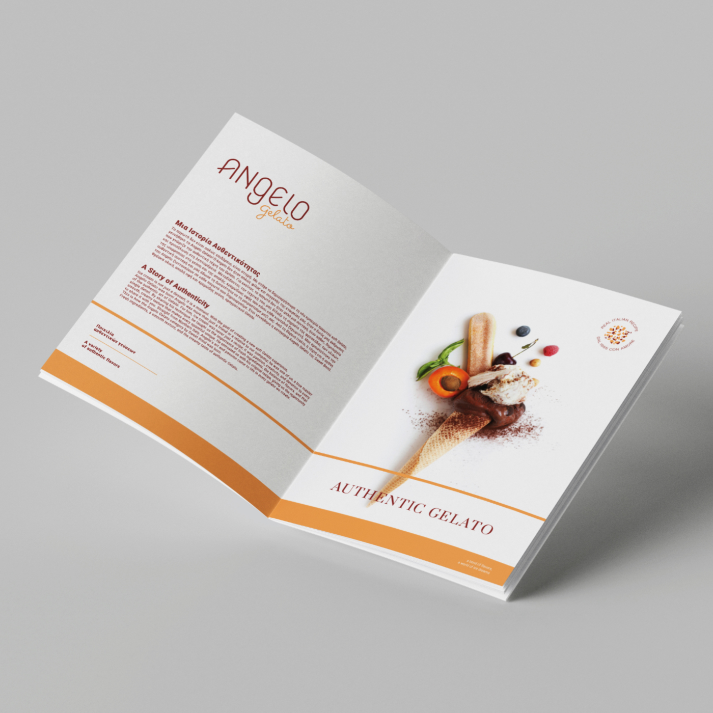
Angelo Gelato by SWEET BOND enters the market as a premium gelato experience, inspired by authentic recipes from Northern Italy. Crafted with pure ingredients and offered in a wide variety of flavors, the line speaks to an audience that values quality, authenticity and refined aesthetics — a balance between tradition and contemporary indulgence.
The ANgELO Gelato logo was developed through a typographic‑driven approach, allowing the identity to unfold through detail, balance and character. The wordmark ANgELO is expressed through a custom abstract sans serif typeface that blends uppercase and lowercase forms, conveying prestige, minimalist elegance and a modern Italian sensibility. The Gelato descriptor, rendered in a slightly modified playful calligraphy, adds movement, flavor and a warm human touch. Together, the two typographic voices meet at a point of harmony: one rooted in authenticity and heritage, the other in vibrancy and delight. They shape the personality of the brand and of Angelo, the Italian pasticcere who stands at the narrative heart of the identity.
The color palette — deep burgundy and vibrant orange — acts like a palette of flavors: warm, rich and premium. It evokes textures, aromas and the sensory world of gelato, creating an immediate and distinctive visual code.
An independent circular seal was also created, functioning as a small “jewel” of the identity. The perimeter text “REAL ITALIAN RECIPE – DAL 1955 CON AMORE” reinforces the storytelling, while the abstract central motif — reminiscent of floating fruit or nut pieces — adds a playful yet refined dimension. The seal works both autonomously and in combination with the main logo across freezers, packaging, labels, social media and multiple applications, serving as a subtle signature of quality.
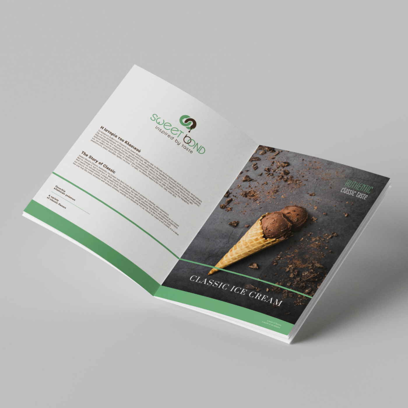
For the product brochures, the design approach followed a minimal, clean and architectural aesthetic. A consistent grid allows imagery, graphics and text to breathe, creating a sense of clarity and rhythm. The color‑based differentiation between the two gelato lines — Sweet Bond and Angelo Gelato — strengthens each product family’s identity, establishing a premium atmosphere with coherence and dynamism. Visual continuity extends to the covers and back covers, where the milk‑splash element becomes a symbol of freshness and high‑quality ingredients. The subtle color variations in the abstract graphics between the two lines complete a system that is both unified and distinct, with a strong presence across all brand touchpoints.