
Logo Design – Corporate Identity, eva’s nails, Chalkida
Logo Design – Brand Mark – Corporate Identity – Creative Applications
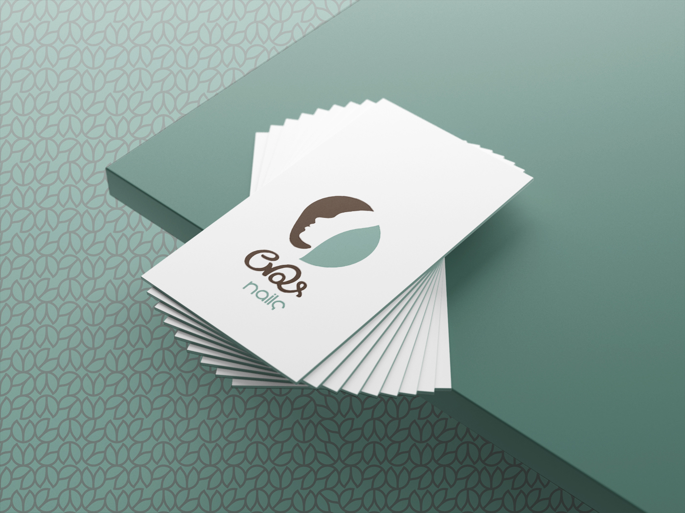
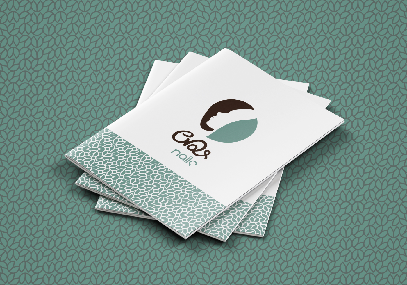
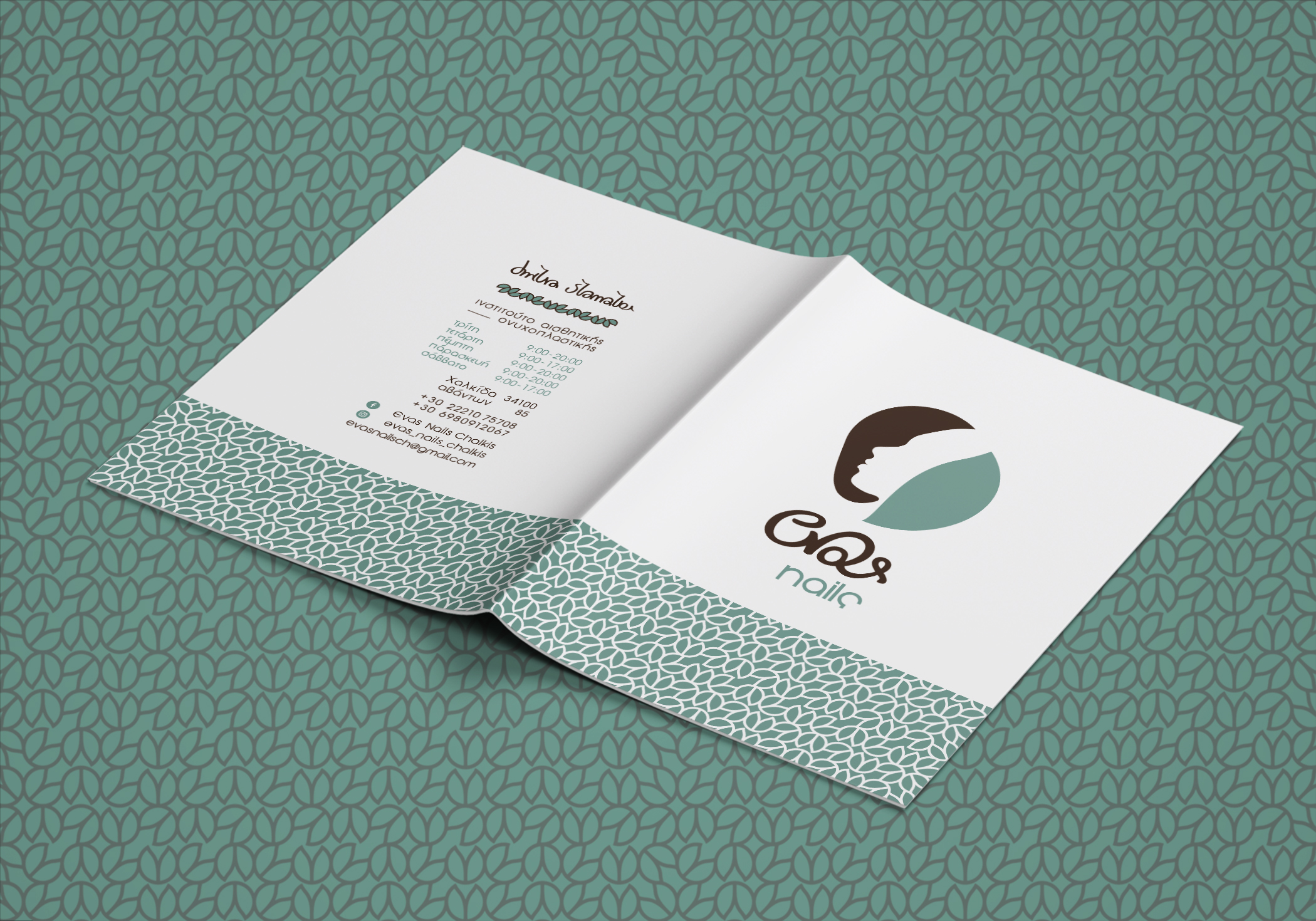
The brand mark draws inspiration from femininity, featuring a stylized female profile framed by two leaves. These leaves symbolically reference Eve, reinforcing the meaning behind the existing naming.
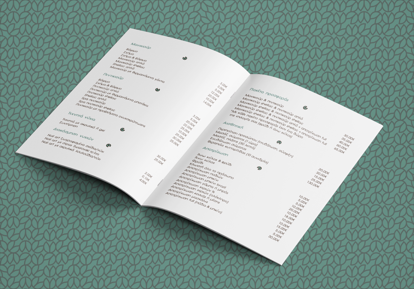
The main wordmark is expressed through a refined custom single‑stroke script, elegant and fluid, while the supporting text is set in lowercase sans‑serif characters, adding clarity and a contemporary tone.
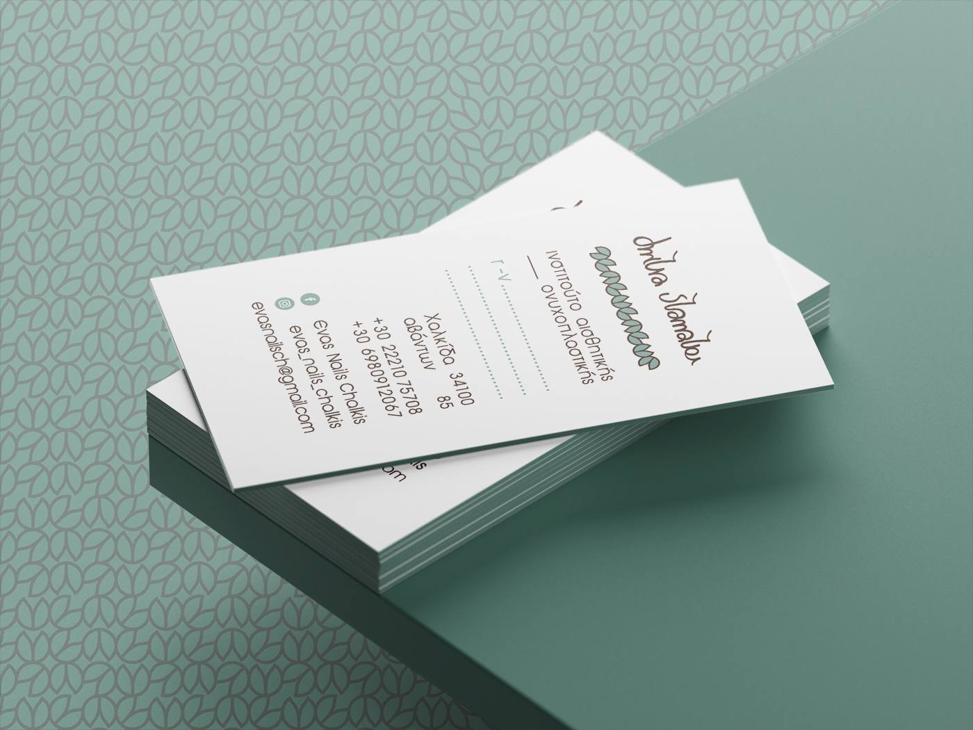
The two leaf elements reappear across the corporate applications, forming a distinctive brand pattern that enhances recognition and visual cohesion.
The color palette — metallic turquoise paired with dark brown Pantone — creates a luxury, feminine and highly appealing aesthetic for the target audience of the nail design studio.
The founder’s signature, rendered in custom freehand lettering, is incorporated into the brand applications, adding a unique, personal identity mark that sets the brand apart.