
Logo Design – Corporate Identitymoto pasxalidis, Chalkida
Logo Design – Brand Mark – Corporate Identity – Creative Applications
© Knowledge Game Design Studio, NIKOLAOS ZISIS
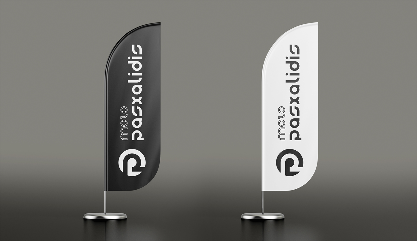
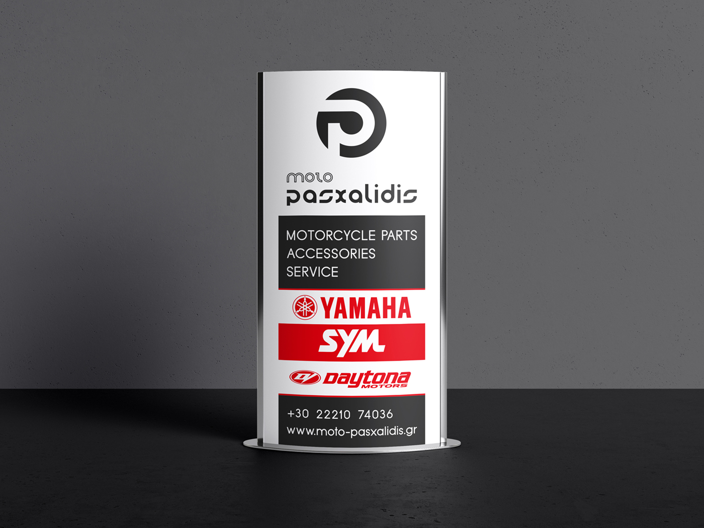
The logo and brand mark were designed around an abstract “P” lettermark enclosed within a circular form that carries a distinctly sporty character. The shape simultaneously evokes a motorcycle wheel, a helmet, and a racing track, creating a layered visual reference directly connected to the world of motorcycling.
The supporting wordmark, in its custom design, follows the same geometric logic, delivering clarity, strength and a solid presence for this well‑established name in the motorcycle industry.
The color palette is based on dark metallic grey (Pantone) with subtle red accents across the brand applications, in harmony with the motorcycle brands represented by the business. The overall tone is sporty and casual, expressing energy, speed and a dynamic identity.