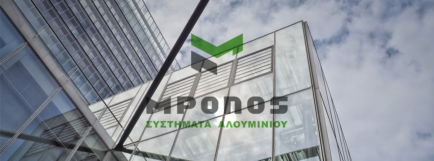
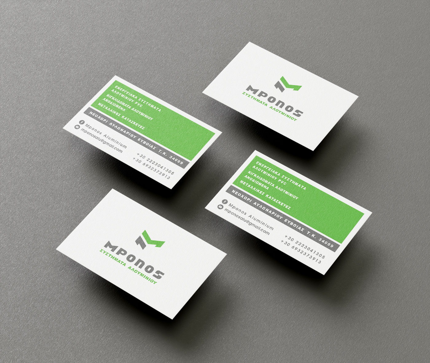
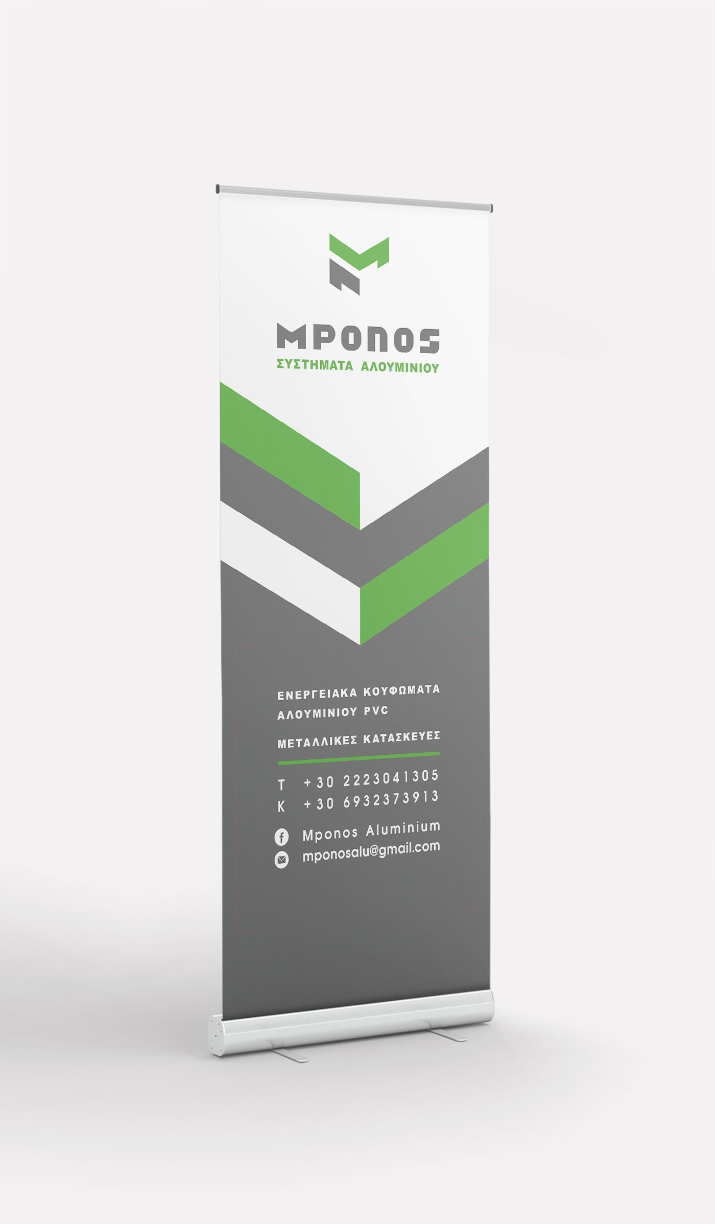
Logo Design – Corporate Identity, MPONOS ALUMINIUM SYSTEMS, Evia
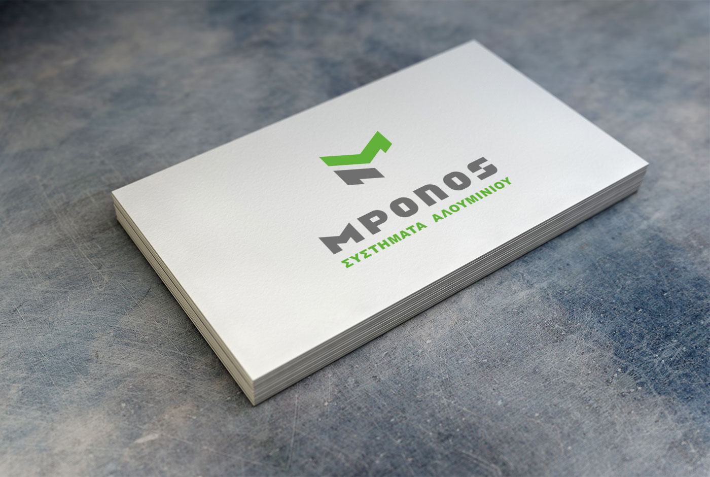
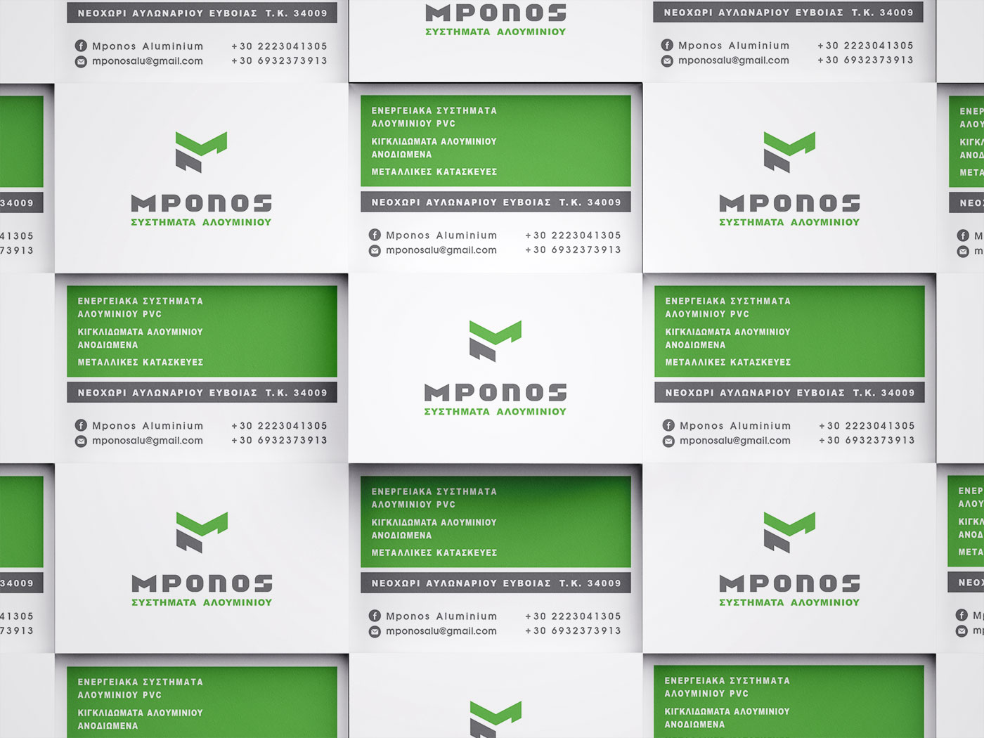
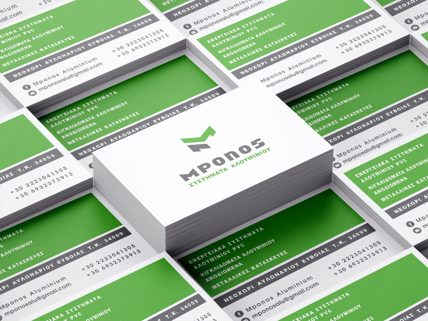
Logo Design – Corporate Identity – Creative Applications
© Knowledge Game Design Studio, NIKOLAOS ZISIS
The logo design focuses on the lettermark M, expressed in an abstract, partially open form that evokes architectural structure and building perspective. The wordmark decodes the naming through a custom sans serif typeface that follows the same compositional logic, combining clarity with technical precision. The symbol also functions as an independent geometric graphic, used extensively across all corporate applications to reinforce consistency and brand recognition. The color palette — vibrant green, grey and white — creates a dynamic and contemporary identity, with eco‑oriented references and a balance between stability and reliability.