
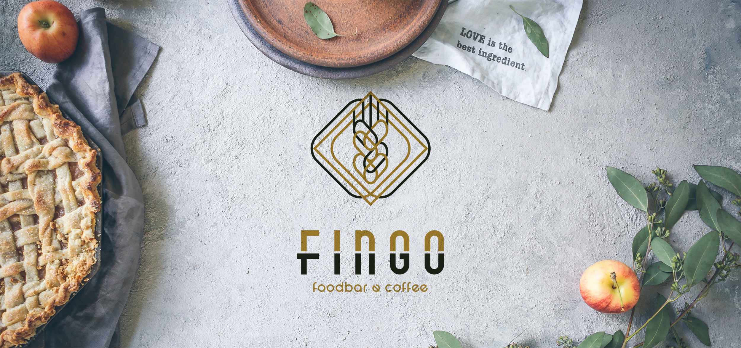

Naming Study – Logo Design – Corporate Identity, FINGO foodbar & coffee, Chalkida
Naming Study – Logo Design – Brand Mark
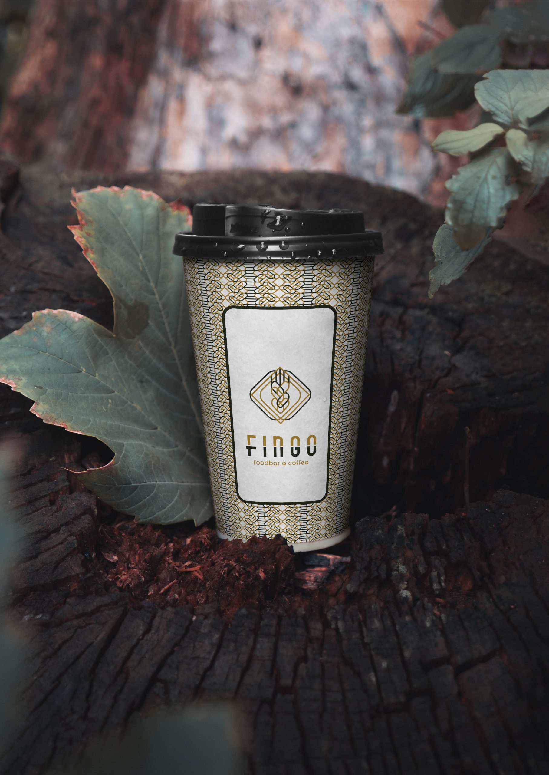
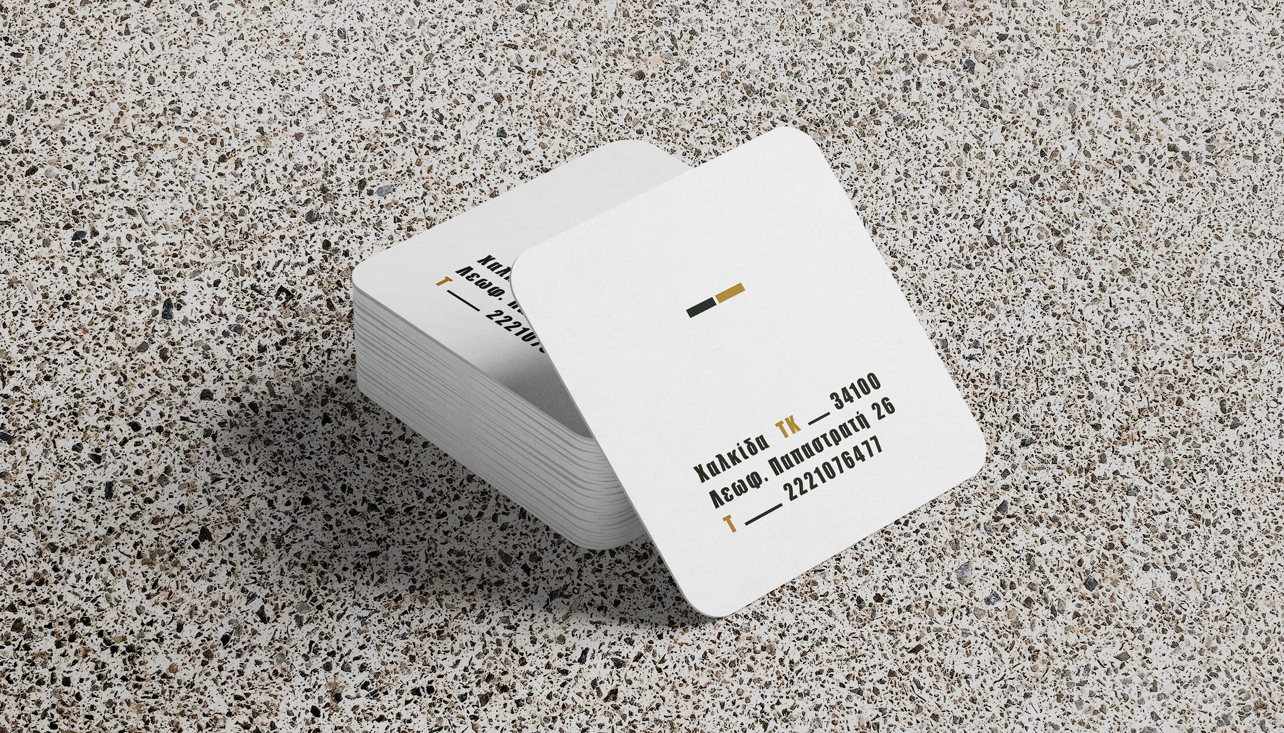
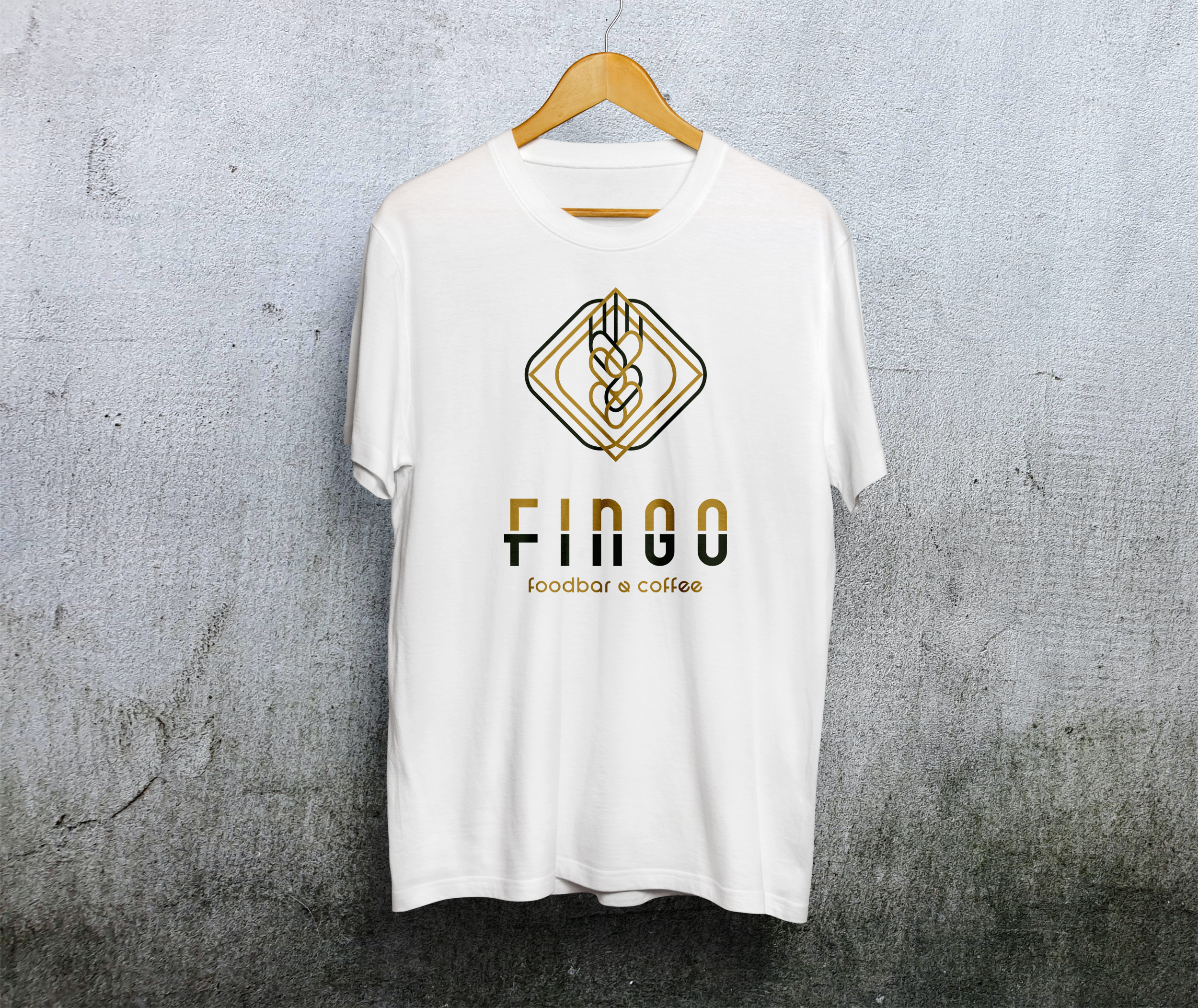
Corporate Identity – Creative Applications
© Knowledge Game Design Studio, NIKOLAOS ZISIS
The initial naming request was “Platho – Platho”. Our studio proposed a more memorable, modern and phonetically strong alternative: FINGO, derived from the Latin fingo, meaning to create — a concept that perfectly reflects the brand’s essence.
The brand mark was designed with geometric outlines and art‑deco inspired elements, which interconnect to form an abstract wheat ear — symbolizing creation, craft and nourishment.
The wordmark is expressed through a custom sans‑serif typeface in bold weight, divided into two contrasting colors to enhance clarity and visual impact.
The brand’s dual color palette — black and copper — is applied consistently across all corporate applications, delivering a premium yet approachable identity. The repetition of the symbol creates a distinctive brand pattern, strengthening recognition and visual cohesion.