Open Competition for the logo and slogan of Drama, as a wine tourism destination (second proposal)
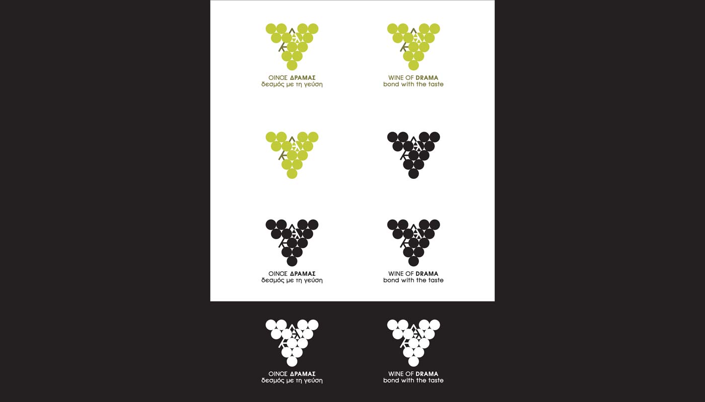
Logo Design – Color Applications – Positive / Negative – Slogan
© Knowledge Game Design Studio, NIKOLAOS ZISIS
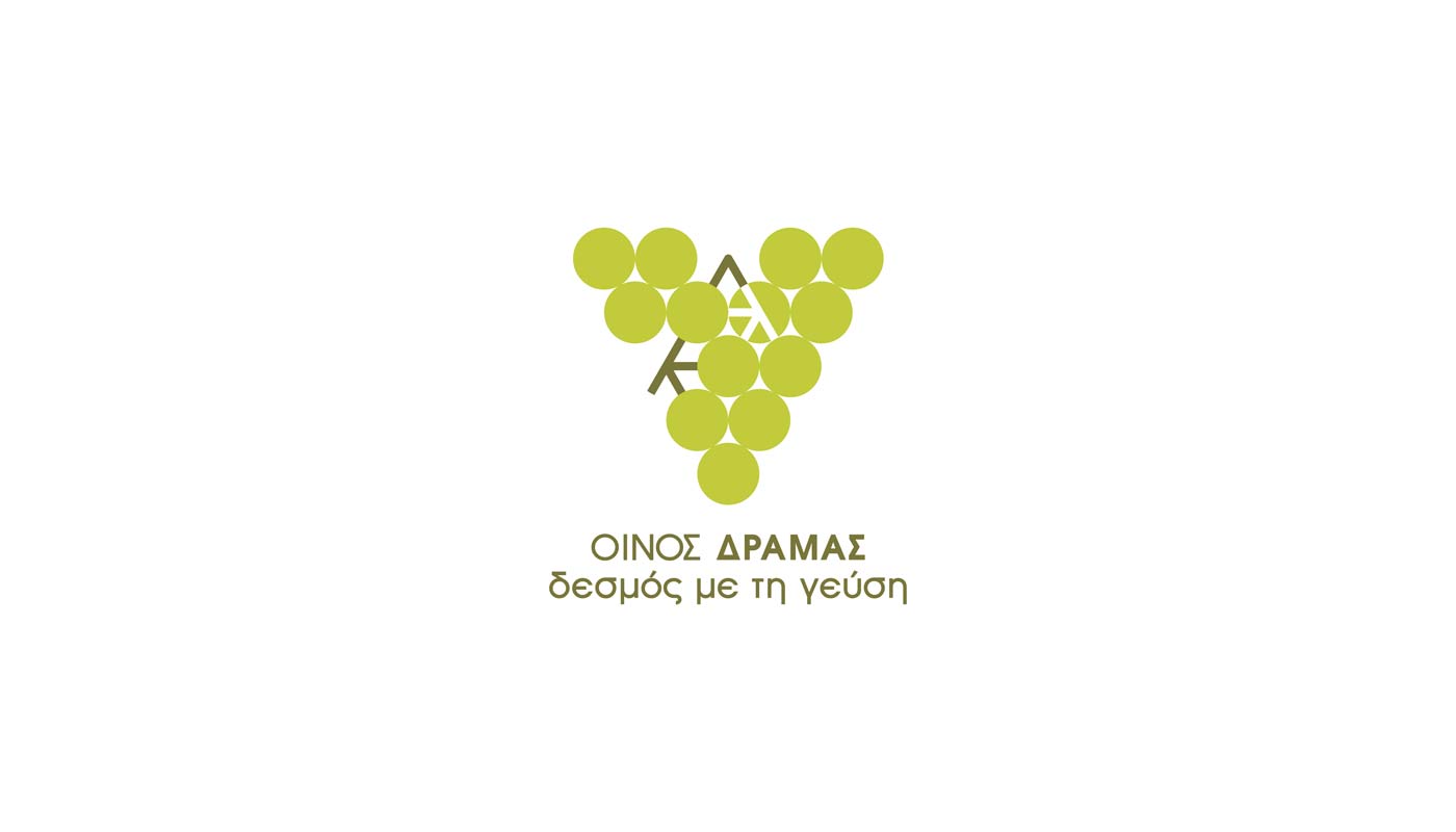
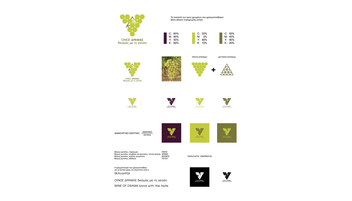
This proposal draws its inspiration from the grape cluster (botrys), a timeless symbol of viticulture. The logo is expressed as an abstract, triangular cluster, within which a repeating “D” is subtly integrated, directly referencing Drama and forming a distinctive, memorable visual identity.
The color palette is inspired by the tones of white grape varieties as well as deep red hues found in darker red grapes, reinforcing the connection to local winemaking and adding warmth and natural richness to the concept.
The result is a contemporary and symbolic identity that highlights wine culture, regional character, and a strong sense of place, positioning Drama as an authentic and appealing wine tourism destination.