
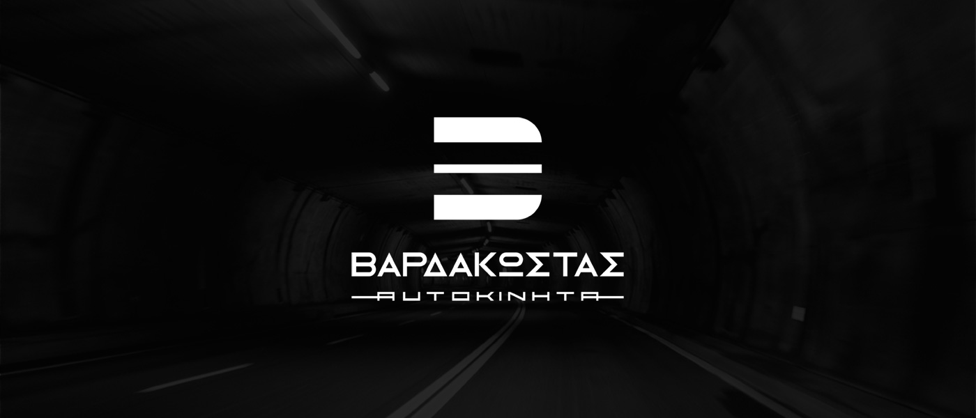
Logo Design – Corporate Identity, VARDAKOSTAS CARS, Chalkida
Logo Design – Brand Mark – Corporate Identity – Creative Applications
The logo design reflects the nature and character of the car‑sales company. The distinctive lettermark “B”, representing the brand’s initial, was created with a minimal, dynamic approach, inspired by: the double road divider line, and the double racing stripes often seen on car hoods.
These references communicate speed, motion, and a sporty attitude, aligning the visual identity with the automotive world.
The wordmark, placed beneath the symbol, was custom‑designed using minimal elongated sans‑serif characters, ensuring clarity and a modern, refined presence.
The color palette, dominated by black and white, is applied consistently across all brand applications, delivering professionalism, simplicity, and strong recognizability.